Project overview
The Ulster Scots Discovery Centre issued a brief to help visitors to discover the rich history of the region through its vast object collection. The museum is not able to display all of the objects in it's collection and wanted a way for users to quickly look at an object from the collection and learn about it's connection to the region and any other objects or content from within the collection that were related.
I worked on both the UX and UI of the interactive during the project alongside artworking various assets for best use and optimising for digital, Working with developer teams and the client as the project manager to deliver the project.
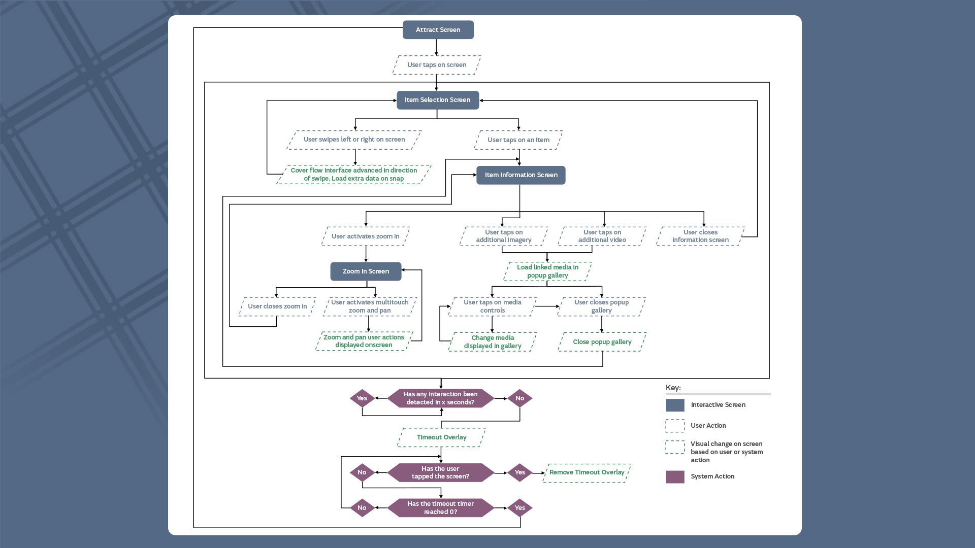
User and system flow for the interactive
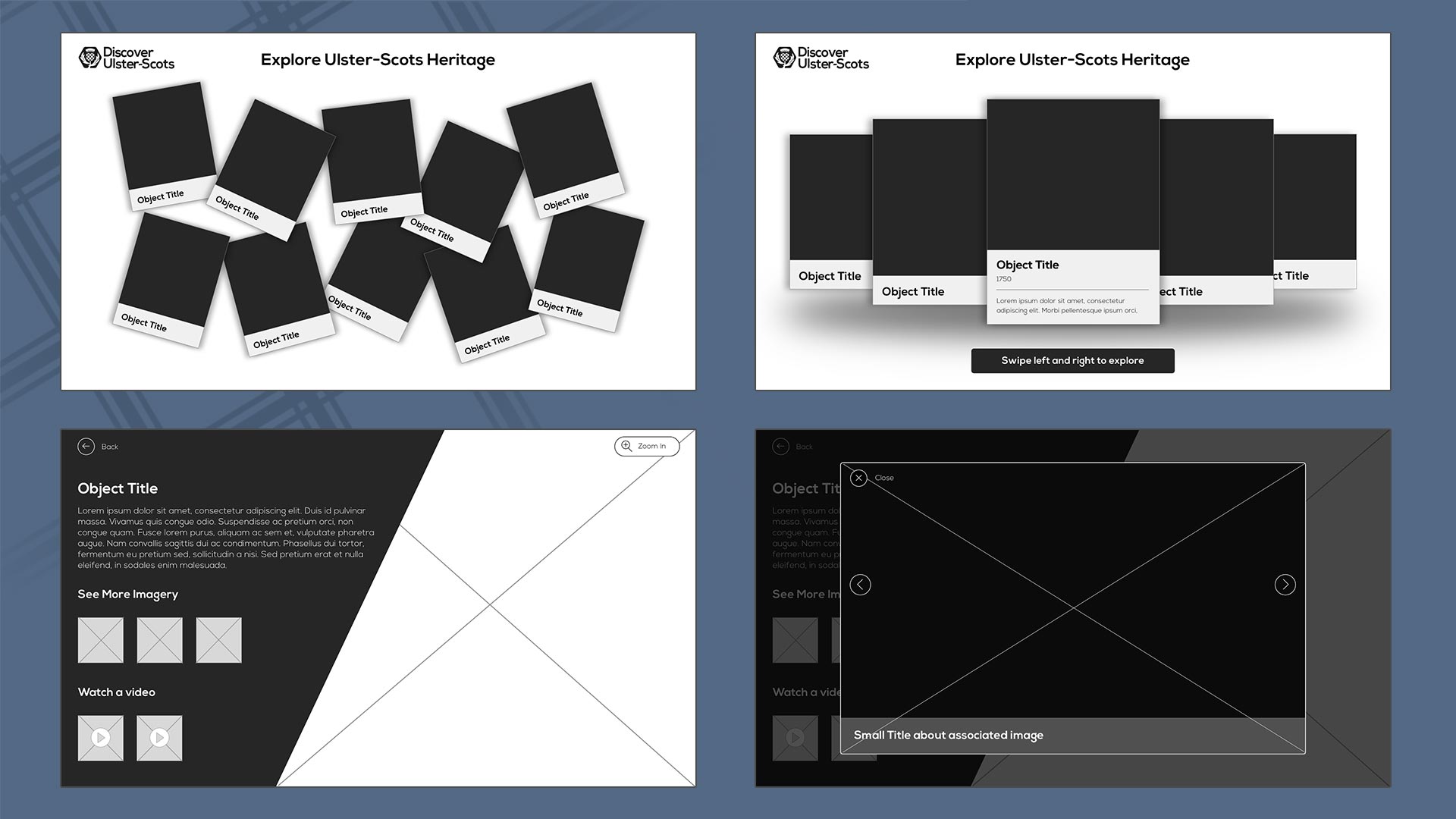
Various screens and interaction types were wireframed for prototyping with Marvel
UX & concepting
The interactive was always intended to be a pick up and down light interactive with shortform content allowing the objects and imagery from the museums collection to shine. Early on I decided that I wanted the interactive to feel like an exploratory journey with no defined start or end, as such the interactive does not require users to look at content in date order.
We worked with the museum to shape this path through the interactive working multiple concepts through to the wireframe stage, running interactive wireframes with staff and users to decide the best interaction methods. The clear winner that allowed users to navigate freely without being overloaded with content was a coverflow method. Working from this we opted to give users the choice of how to explore content further through the interactive with modal loaded further imagery and videos. As some of the objects featured great detail such as clothes or written documents we opted for a free roam image view that allowed users to zoom and pan around the object.
UI & Deployment
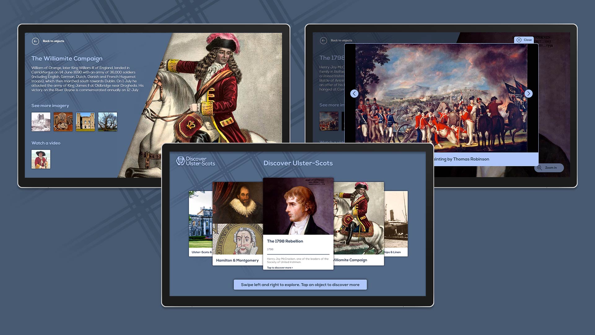
The museum had recently undergone a brand refresh to coincide with this we worked against the extensive print guidelines to create our own digital style guide. This allowed us to quickly establish colour and type schemes that could be applied to the digital output. As a result we created an interface design that put the objects front and center and talk for themselves. Light touch animations were added to the build where appropriate to add depth and character to the interactive.
With the UI established I worked closely with our developer team to create a package for the client that was easy to manage and maintain over the years, with a cms esque config file added to the build that allowed for content to be added or removed over the lifespan of the project. This was all packaged into an easy to use install wizard that installed and configured the interactive for hands free usage on boot of the PC.