Project overview
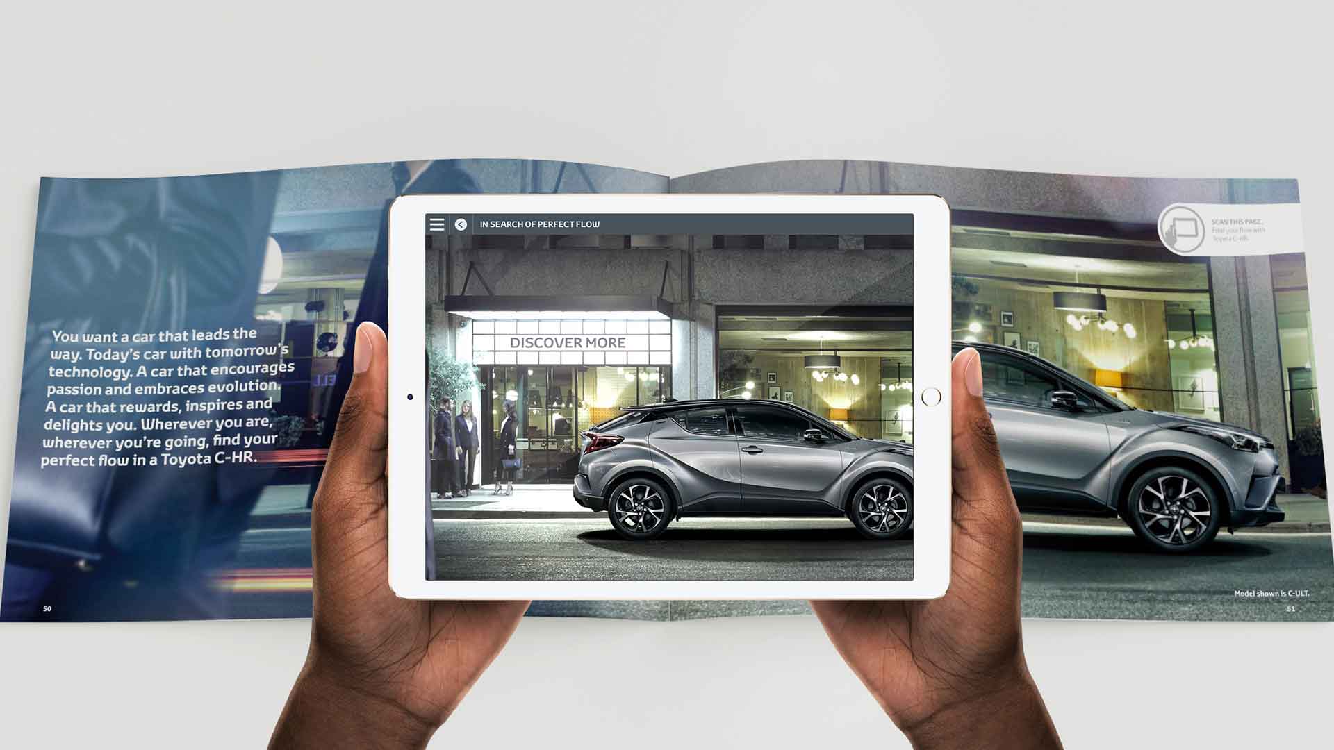
As part of Toyota Motor Europe's expanded digital output we were tasked by Saatchi & Saatchi to create a new augmented reality application that would allow customers to explore further through printed brochures than would be possible in printed form. The app had to work across various Android & iOS devices and also had to automatically detect and deliver content for different european markets.
Over the extended lifespan of the project I have worked as the lead UX/UI Designer on the application through to managing the content server and creating over 50 different car packs for various markets across Europe. As the project progressed into a stable state with no further development updates I have maintained the server alongside producing a content library microsite for staff to see what possibilities each module in the app had.
UX & concepting
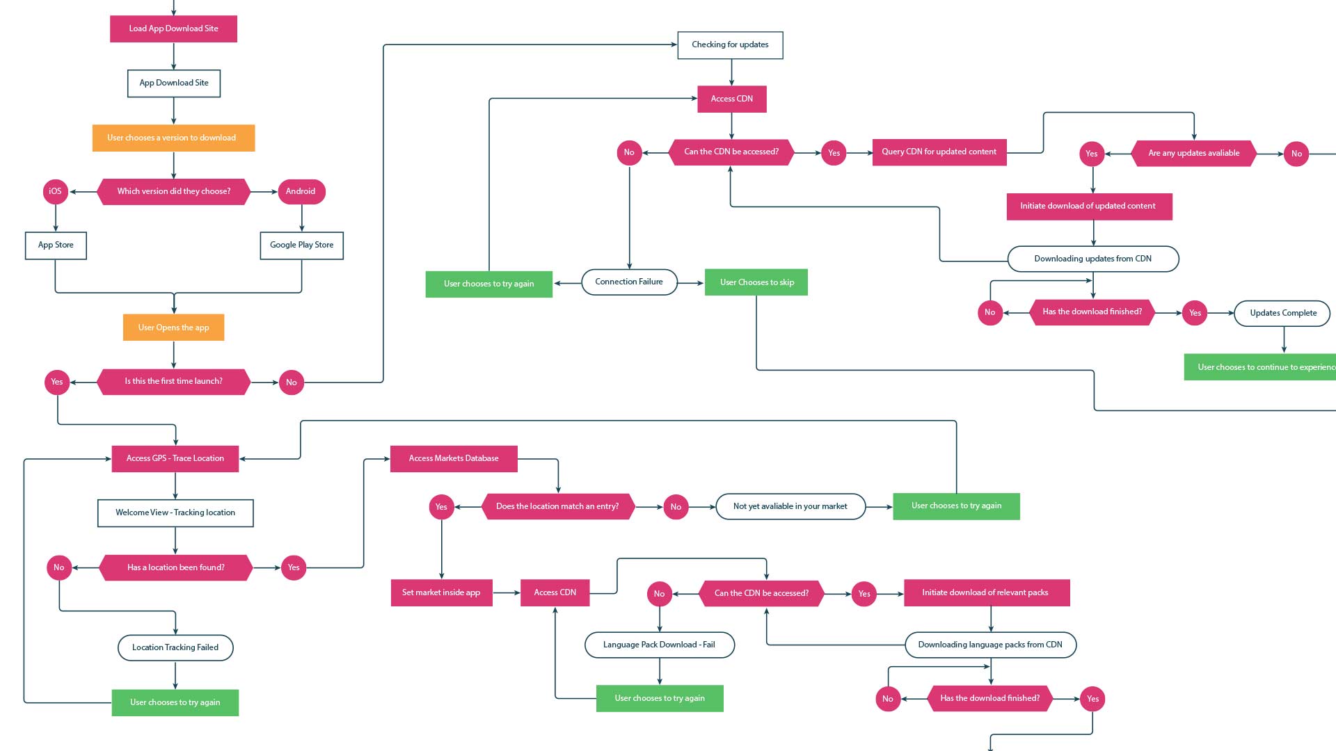
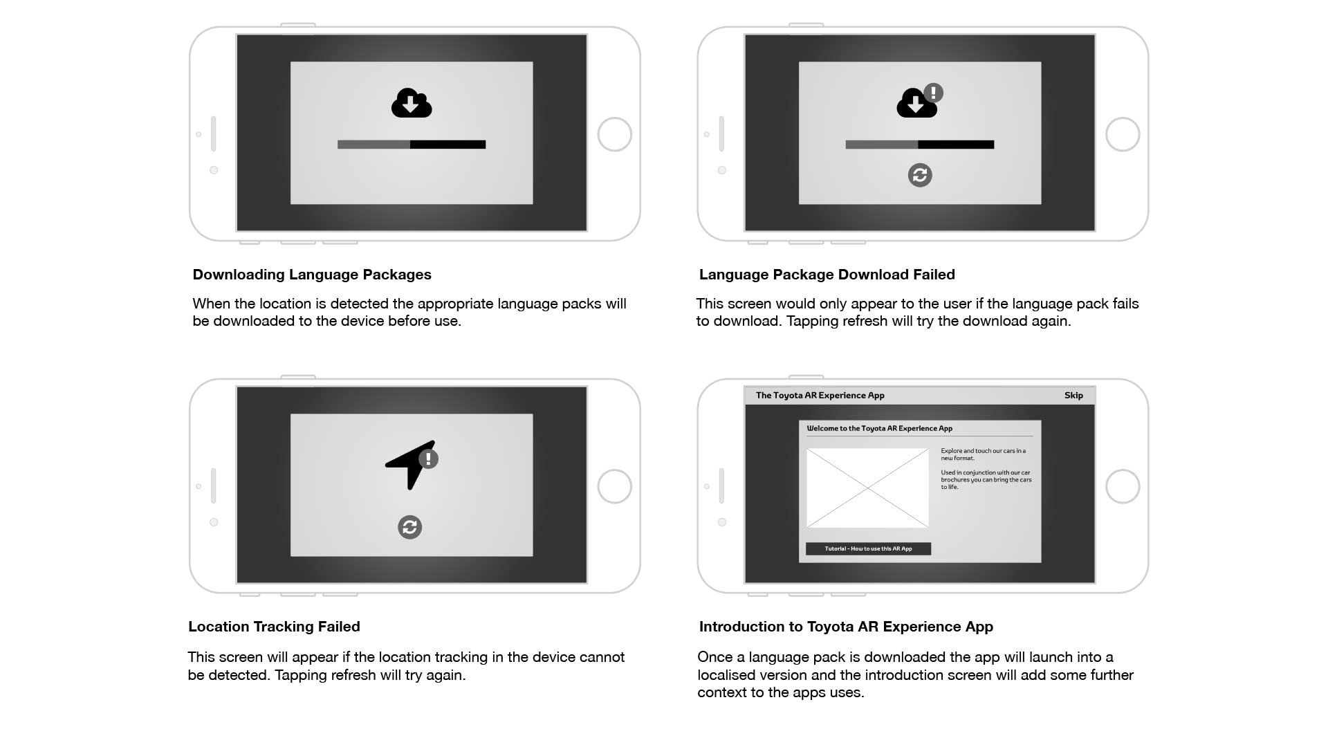
After assessing the apps needs we created various concepts for initial starting content that could be loaded from a brochure. It was decided to create individual modules for each experience as this allowed for further flexibility in the future. As defined in the brief the app had to work in various different countries across europe, we tested the idea of selecting from a list of countries to lock the app into a location but this did not resonate well with end users. After further testing research we chose to automate the process by using the phones geo-location, this required an initial onboarding that was word free as we could not include instructions in all languages.
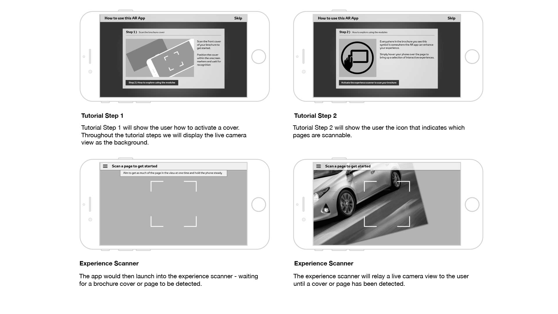
After solving the largest UX issue in the app I worked through the rest of the application in wireframe and userflow form detailing how each section of the app would function and display. We tested this with the end client using clickable protoypes in Marvel.
UI & deployment
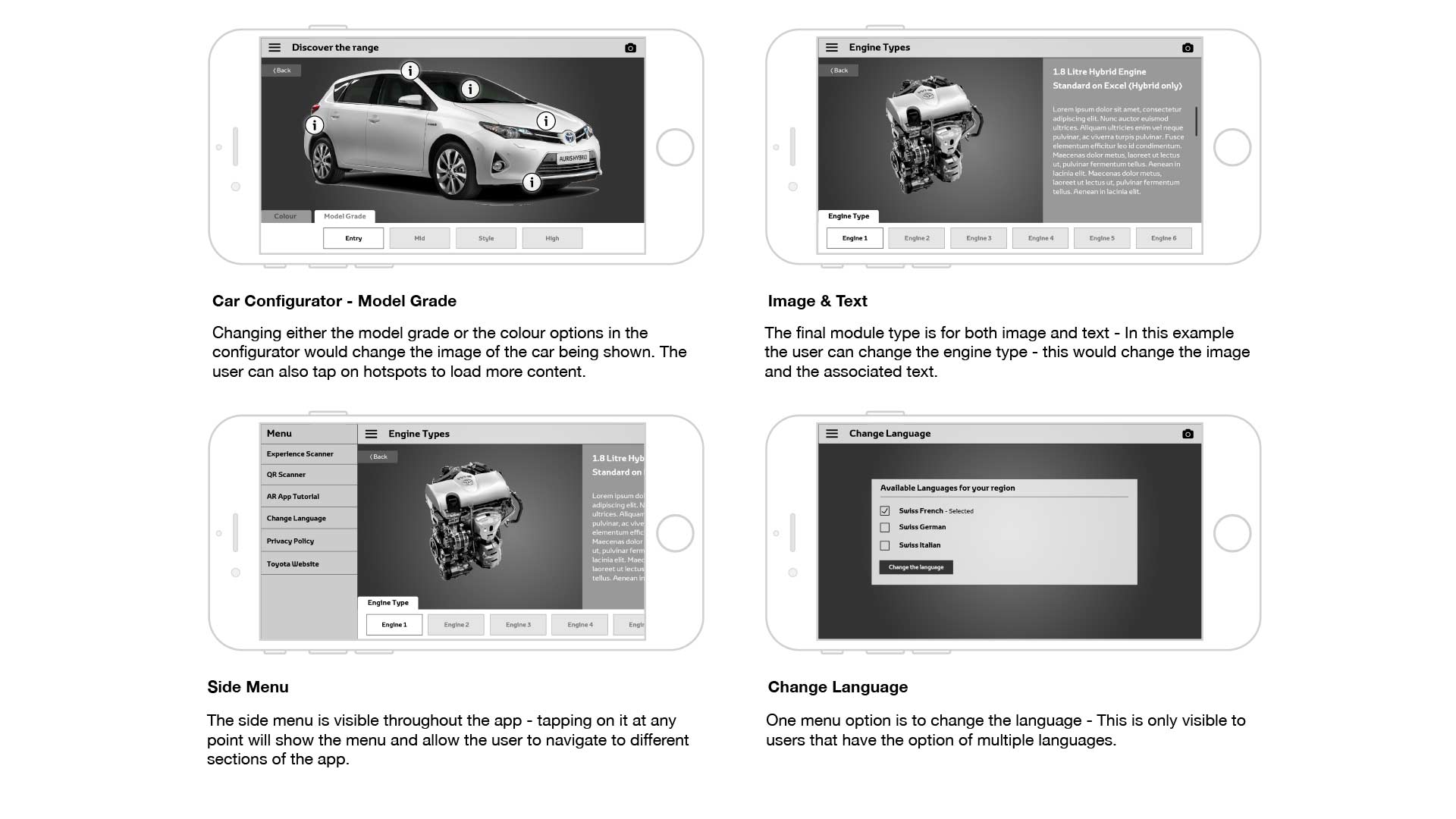
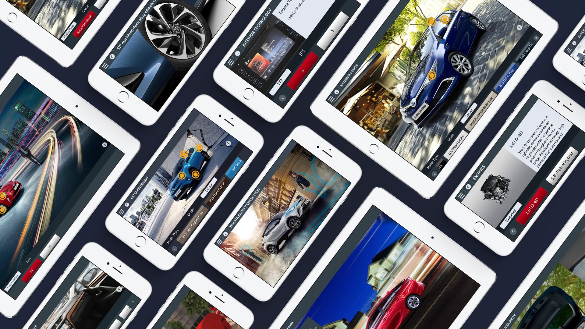
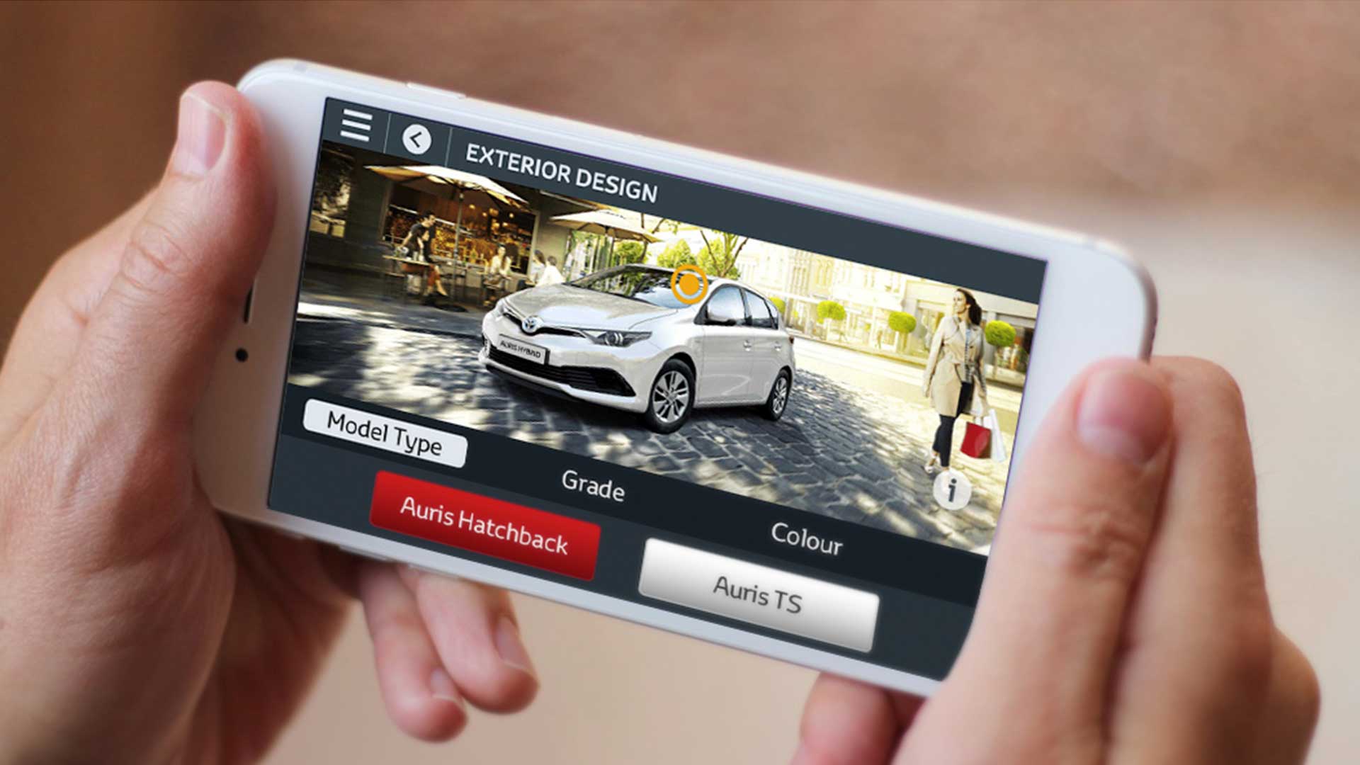
Toyota Europe has a built style system with regards to UI elements and the challenge was to slot this style into an app that needed to work against any content, as the app was also to be used all across Europe special attention had to be made during design for allowances for different character sets and length of words. I also wanted to keep a consistant feeling between iOS and Android versions of the application, as such I created a framework design that allowed the content pieces in each car pack to shine. Leaving a large central region for content with smaller panel based control units for areas such as configurators where users can change the colour and grade of a car, or panoramic viewers where users can spin the car around in 360 degrees.
The development of the interactive was produced in native environments for each platform using the AR engine Wikitude, The application was tested and developed across a wide range and quality of devices to determine any robustness issues especially with such a wide breadth of devices in the Android ecosystem. The app was released to markets simultaneously and currently has over 8 different car packs released to 16 different European markets.
Toyota Explore AR in action
