Project overview
The Abdullah Al Salem Cultural Centre was a multi-year project to create a world class museum covering Kuwaiti history all the way through to natural history. We were approached to work on all the digital interactives in the Natural History & Science blocks. This covered a wide variety of experiences from digi-physical to standard touchscreen interactives combining multiple pieces of technology and approach. With the unique challenge of every interactive having to work and interpret across both English & Arabic.
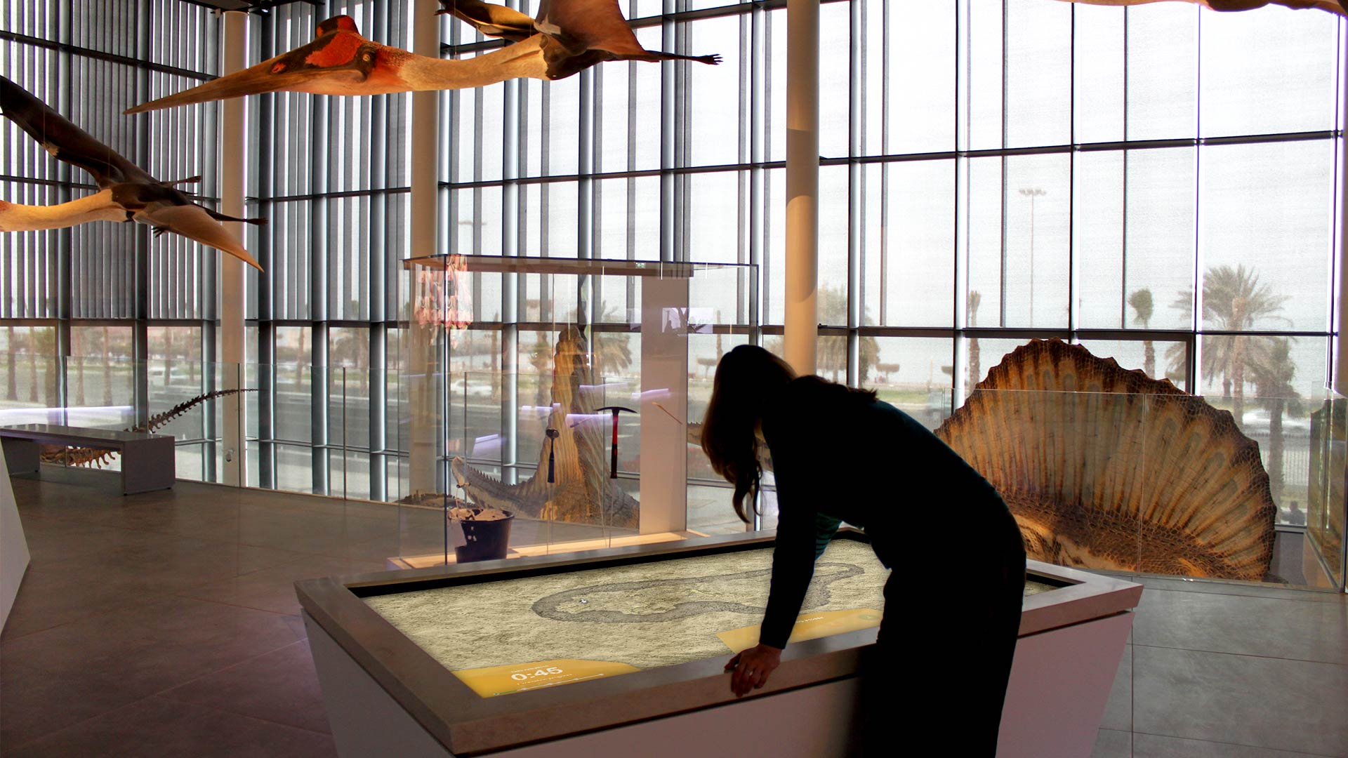
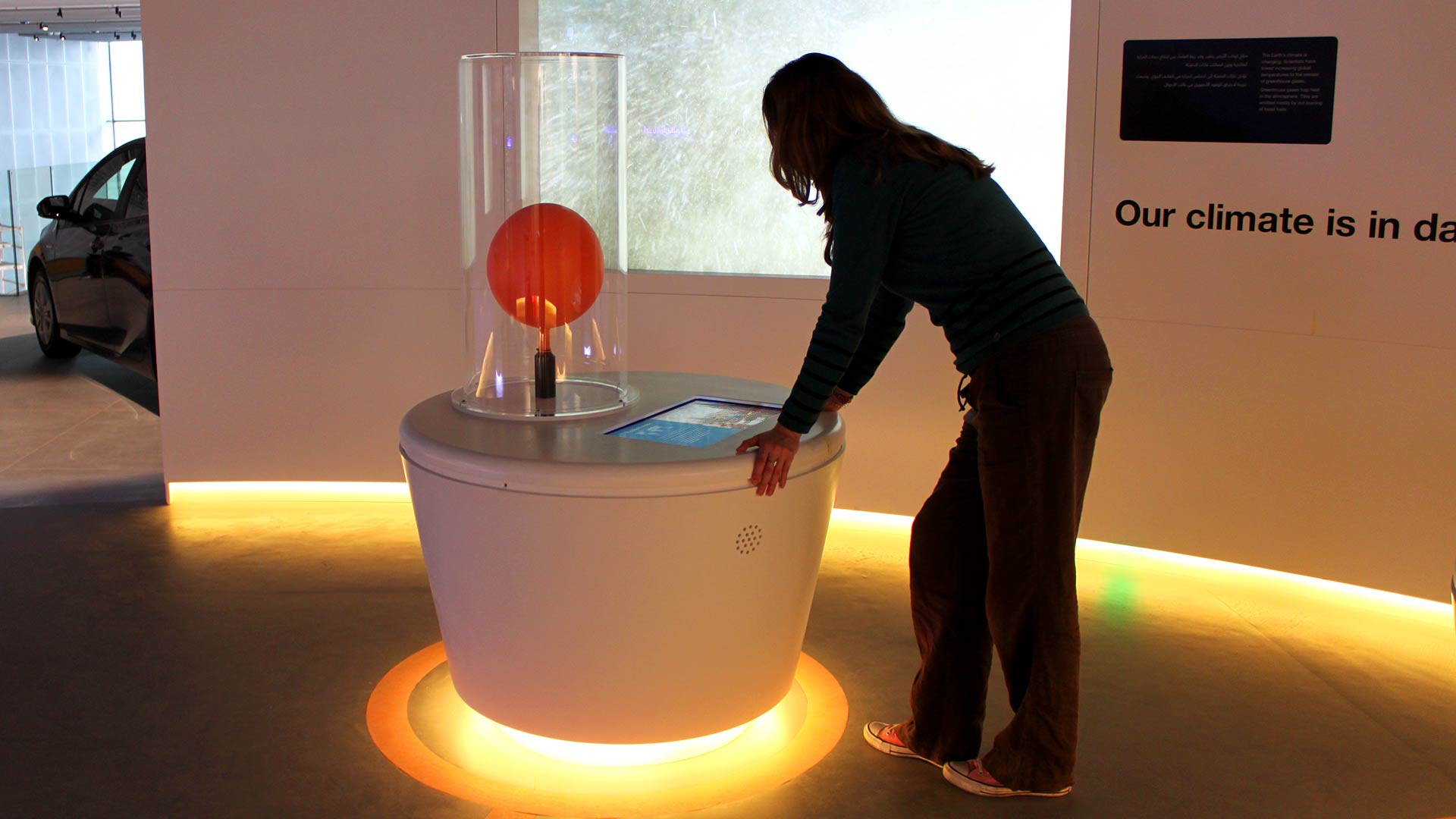
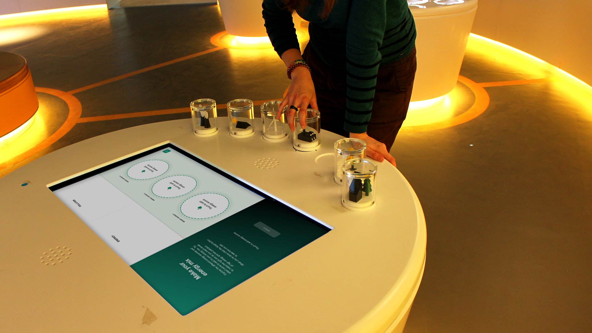
With a total of over 50 interactives in the block I worked across various roles on the project. Working on my own set of 10 interactives whilst also managing the project as a whole with internal design teams and external contractors and client teams. As the project progressed I worked with technical teams on delivery of the interactives with extensive testing and installation time taking place in Kuwait.
Recycling Challenge Game
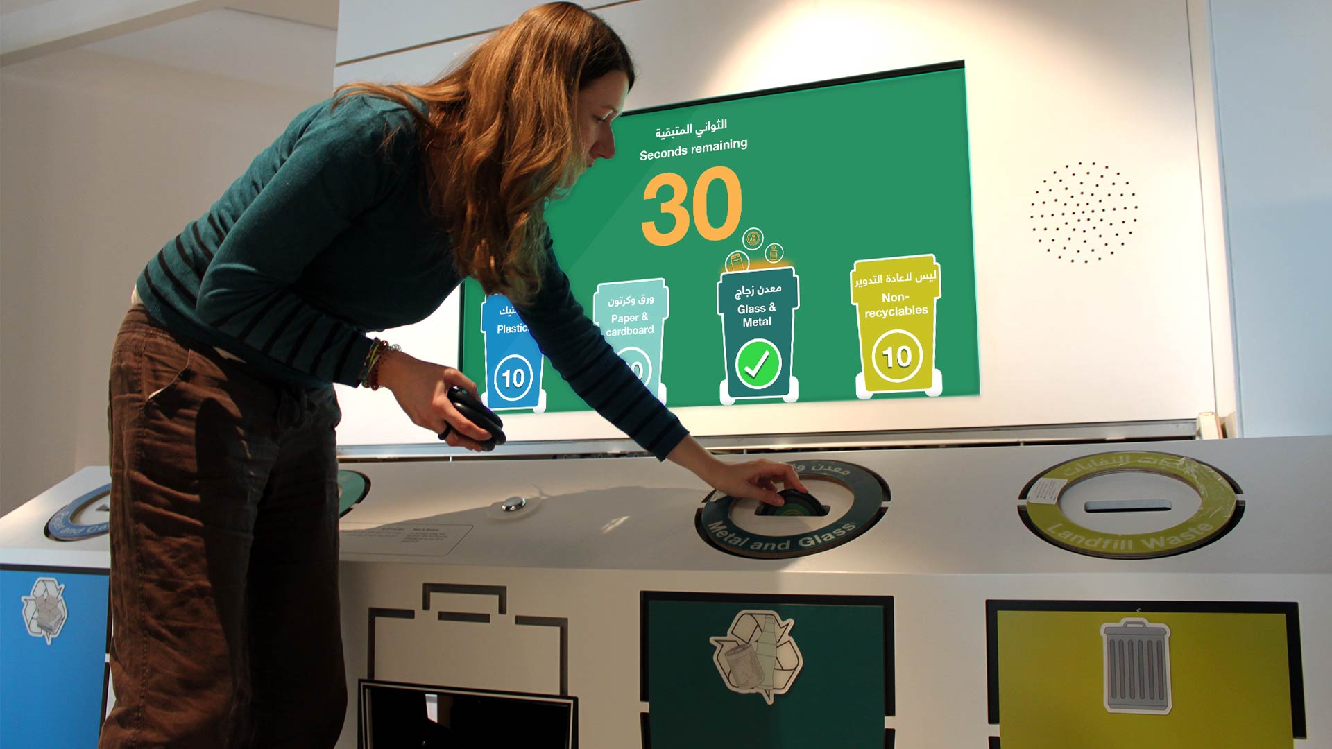
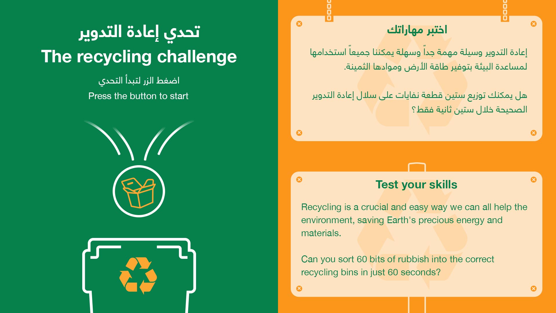
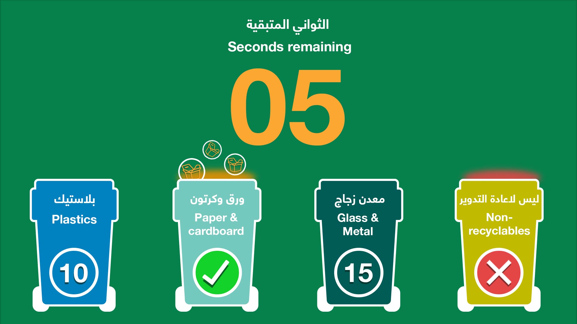
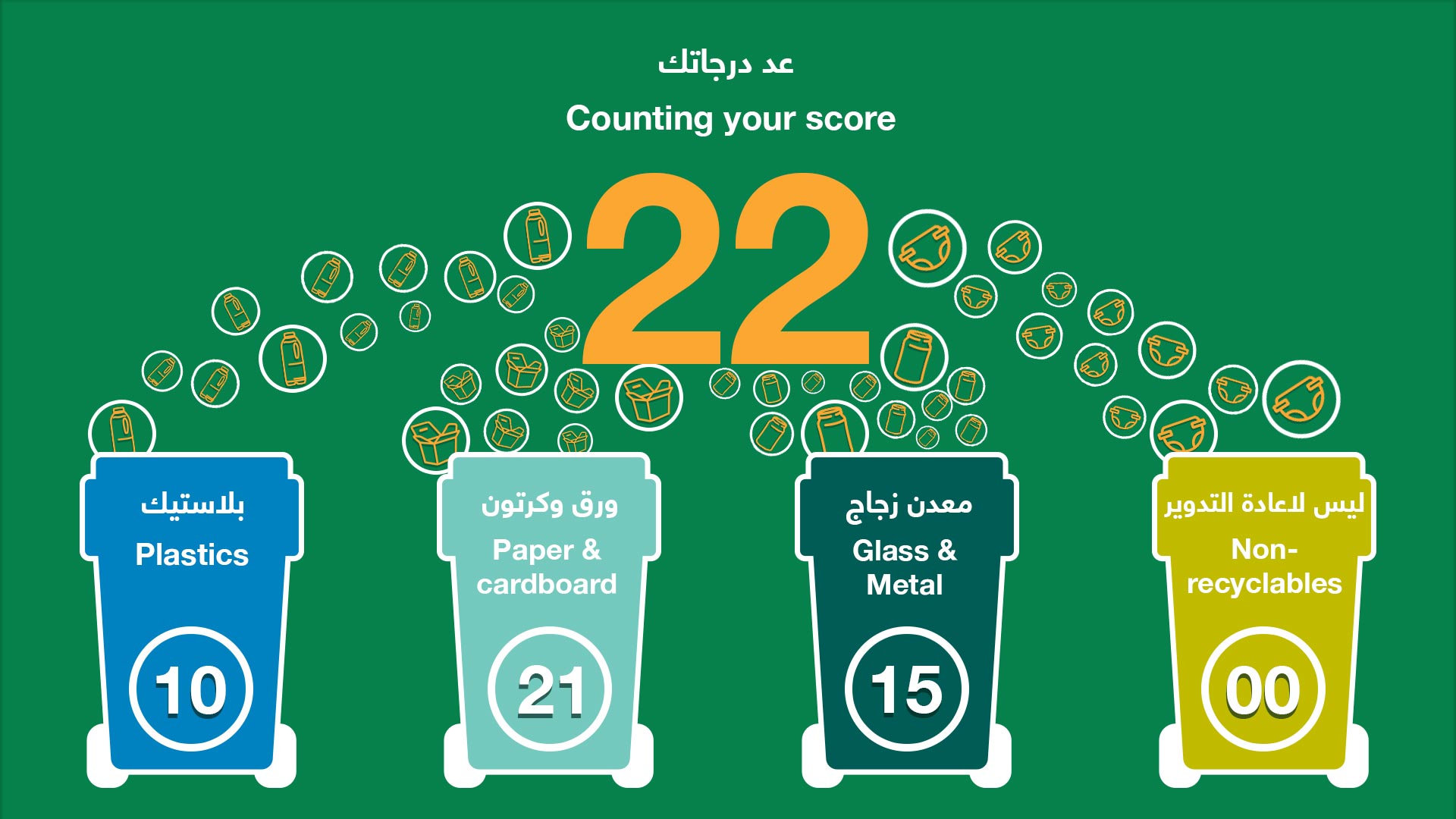
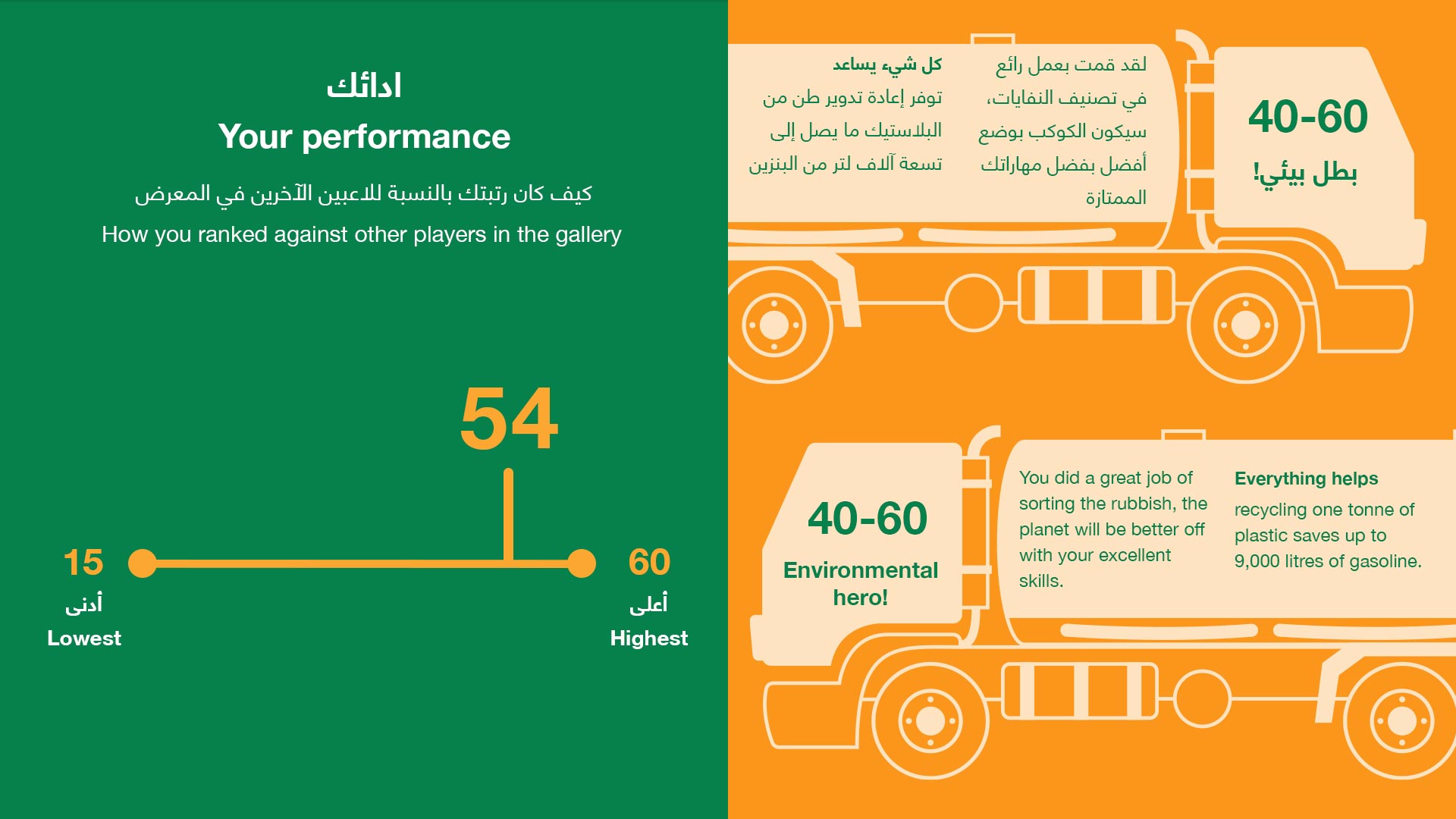
One of the interactives I designed for the project involved the sorting of rubbish to test users knowledge of which items can be recycled. Kuwait has various different bin types for each type of recyclable and a separate bin for landfill waste. The challenge was to create a game experience that felt fluid and quick paced which also informed users of their actions.
Through discussions with the hardware contractors and the original briefing teams for the project we decided to opt for an RFID based system, with an underlying framework of 4 readers and various pucks with RFID tags inside. As the user dropped the pucks into the slots in the setworks the system would recognise the puck ID and determine whether the item had been sorted correctly.
When designing the core experience I wanted users to not be drawn from the sorting to the screen above them, I created a game format for the interactive where users have to sort against the clock creating a frantic and exciting gameplay experience where users have to think on their feet. As such I purposely paired back the wall interface focussing on displaying only the essential information such as the remaining time and the current score of each bin.
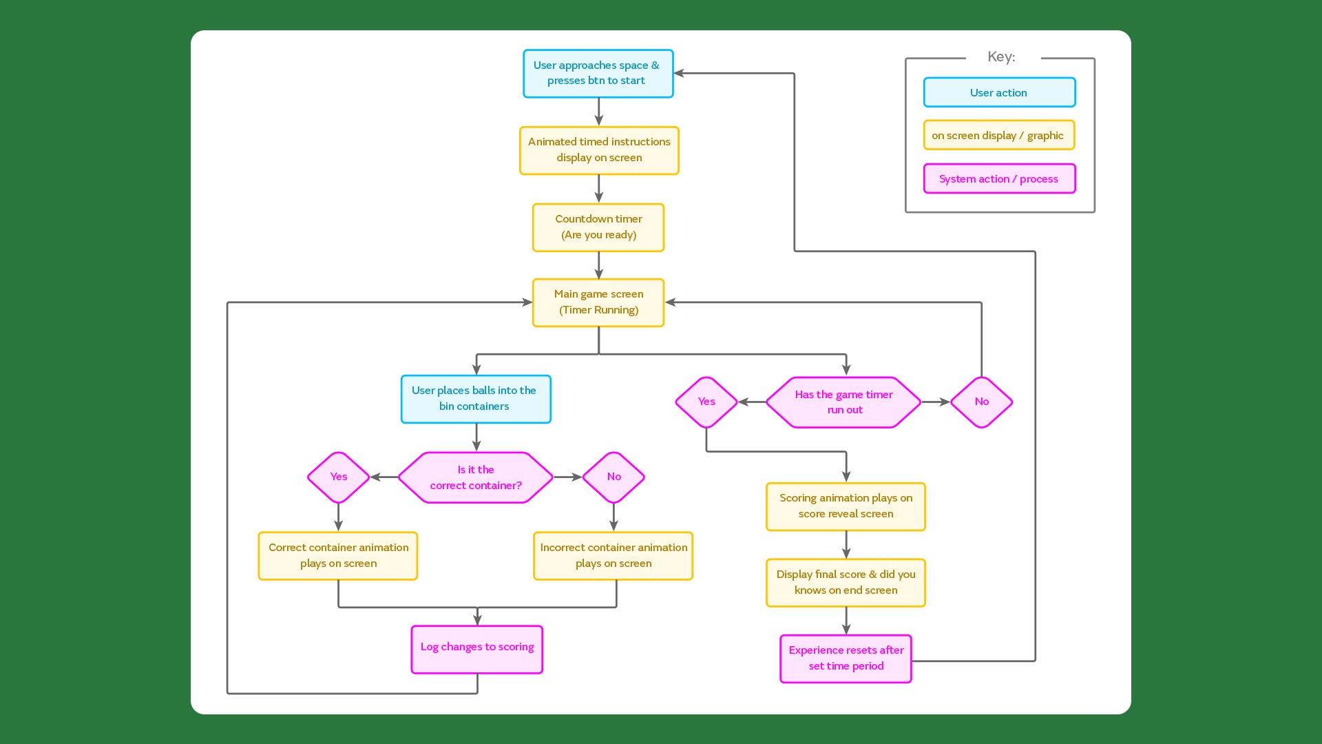
Interactive user flow
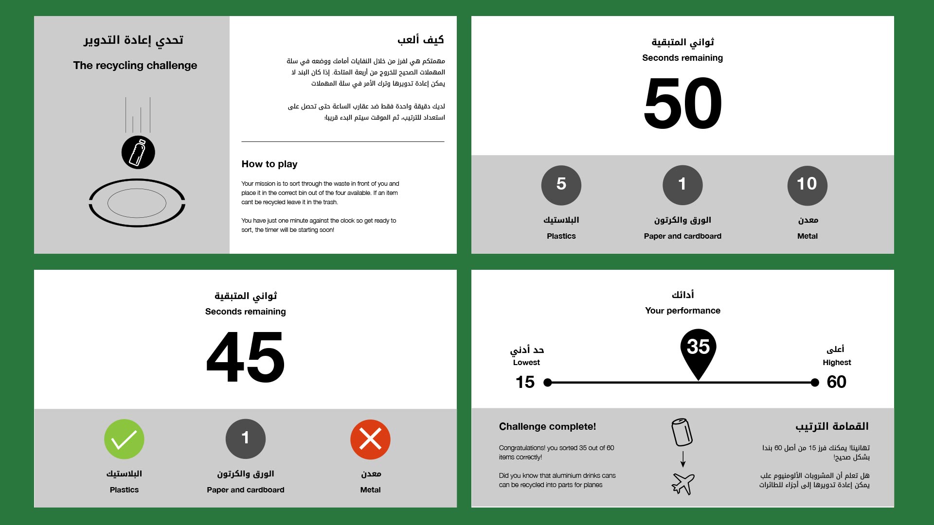
Experience wireframing
Dino Viewer AR interactive
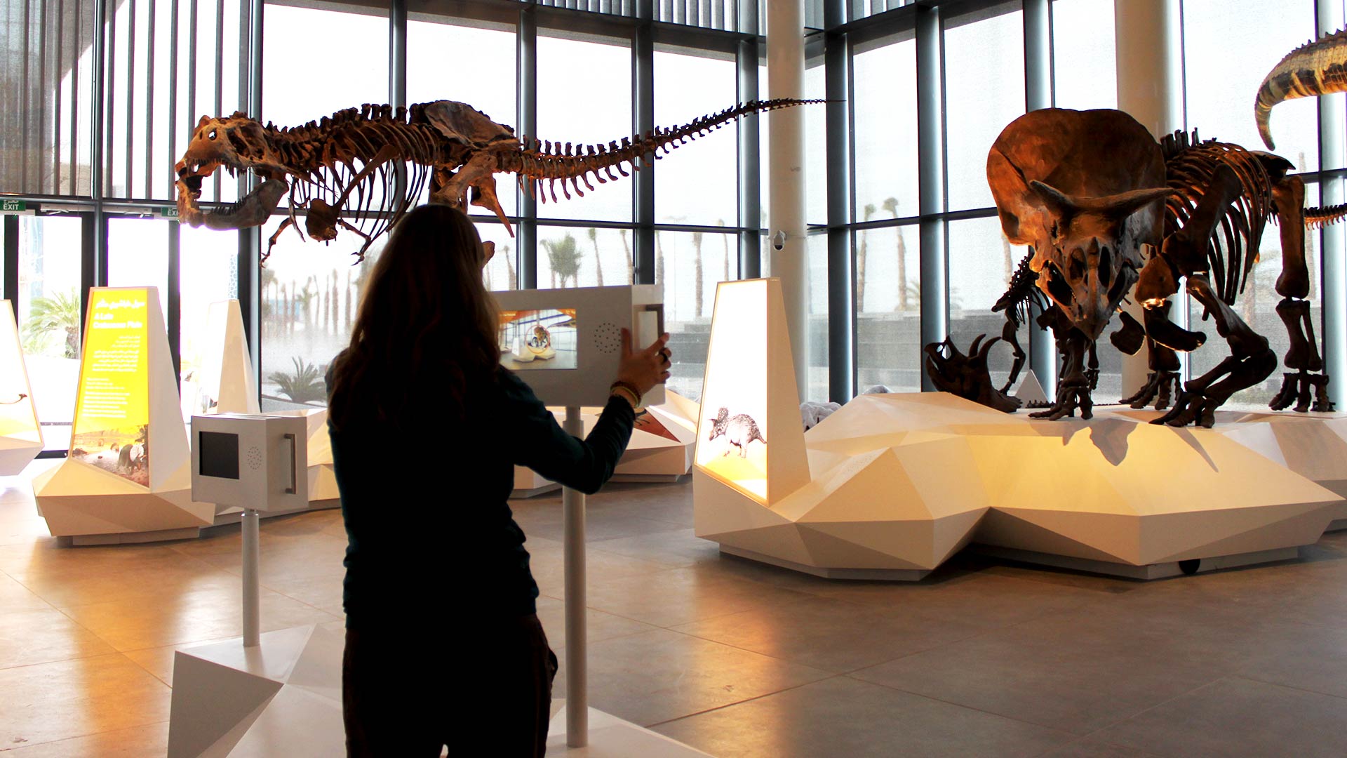
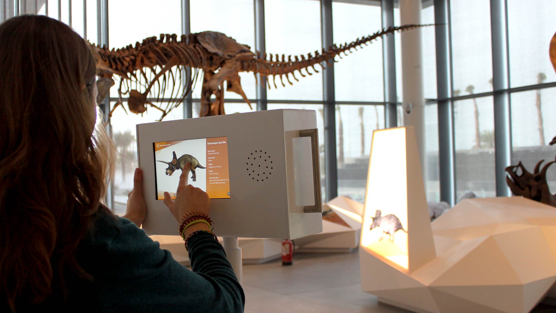
Throughout the prehistoric history gallery are a series of dinosaur models depicting dinosaurs through different prehistoric eras. The brief was to create three interactives where the dinosaurs in front of visitors came to life in a dramatic manner. Through consultation and creative planning we opted for a physical AR interactive where visitors would spin digital signage to discover the creatures.
During initial conversations with the site contractors and hardware we had to think creatively with solving the issue of tracking the dinosaurs - the initial thinking was that the device would pick up the dinosaur using shape detection, however this would not have been appropriate in the space due to light restrictions and other museum go-ers walking in front of the dinosaurs. To solve this issue we opted to create an AR experience where the tracking was detected via a Phidgets rotation sensor, as the user reached an angle that was defined in the configuration the dinosaur 3D model would be displayed onscreen.
Throughout the design process of the interactives we had to think about theming and deeper level interpretation. To accommodate the three different era's of dinosaurs I created a framework design that could be themed with three distinct colour schemes that were taken from the design guidelines for the galleries printed materials. This allowed us to create one software piece with identical layouts switching out visual assets as needed. Through user testing this was deemed to be the best approach as user's that went from one terminal to another knew exactly what to do as the interactive felt and reacted in the same manner.
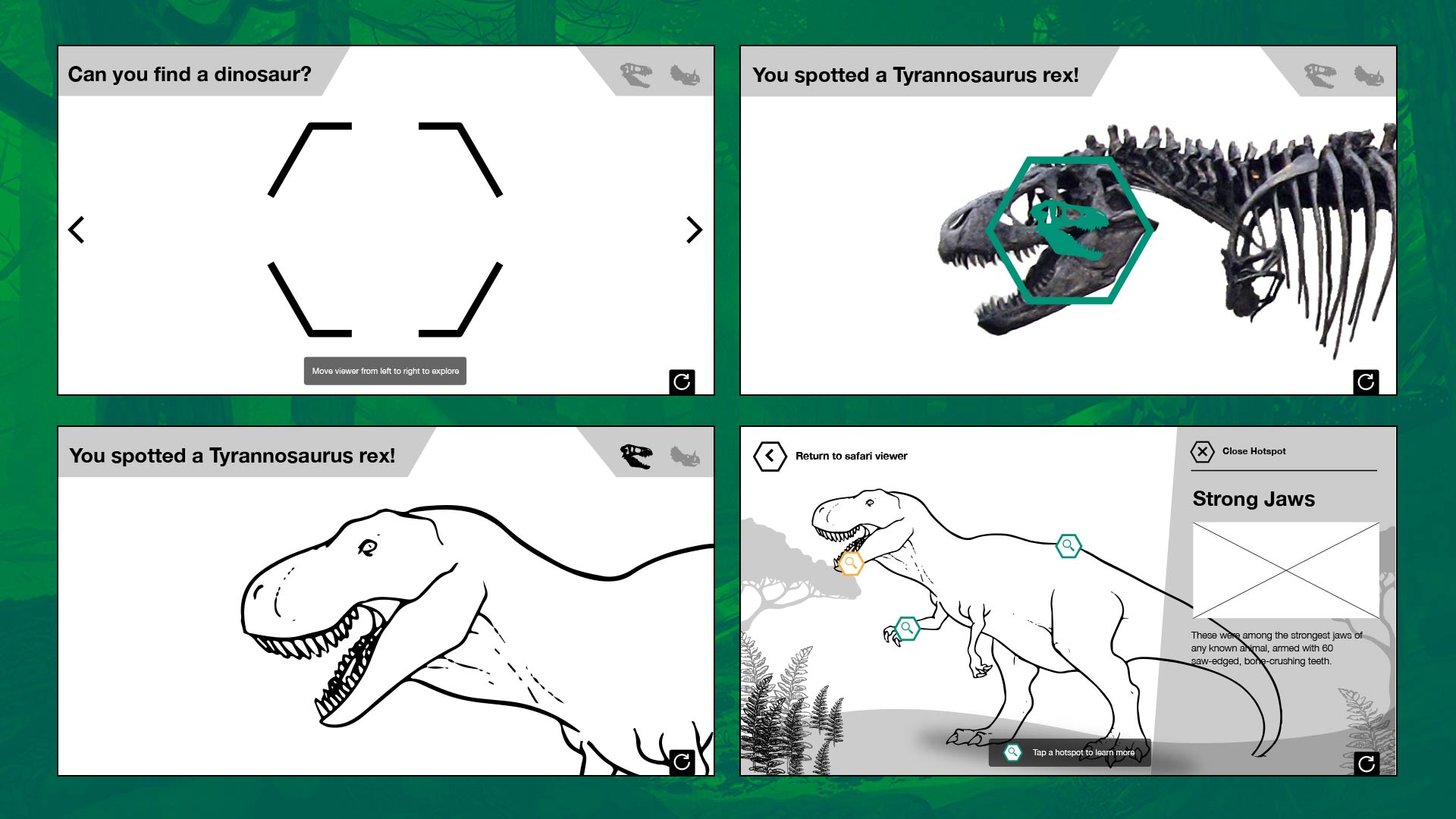
Experience wireframes
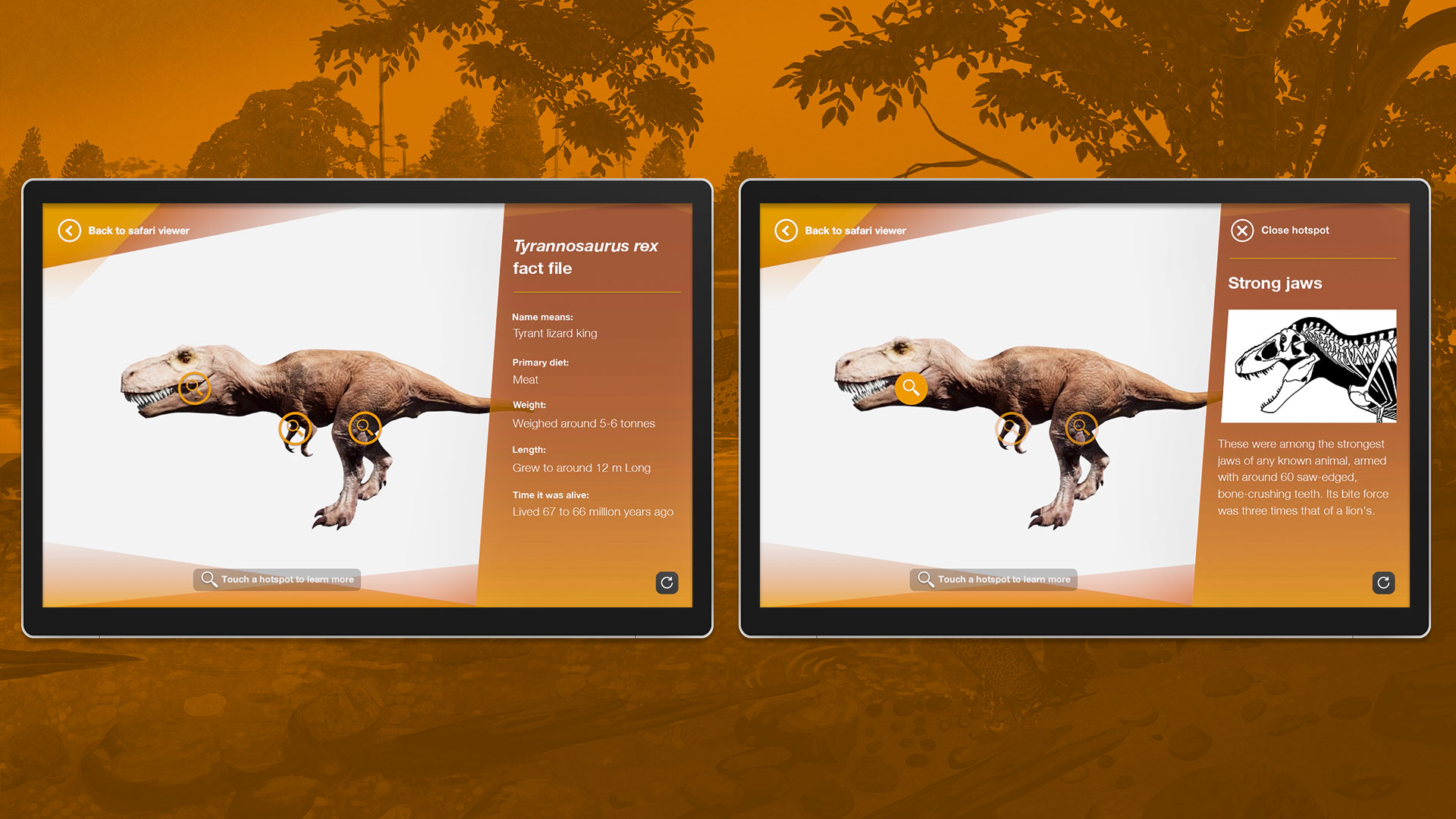
Trex - english info screens
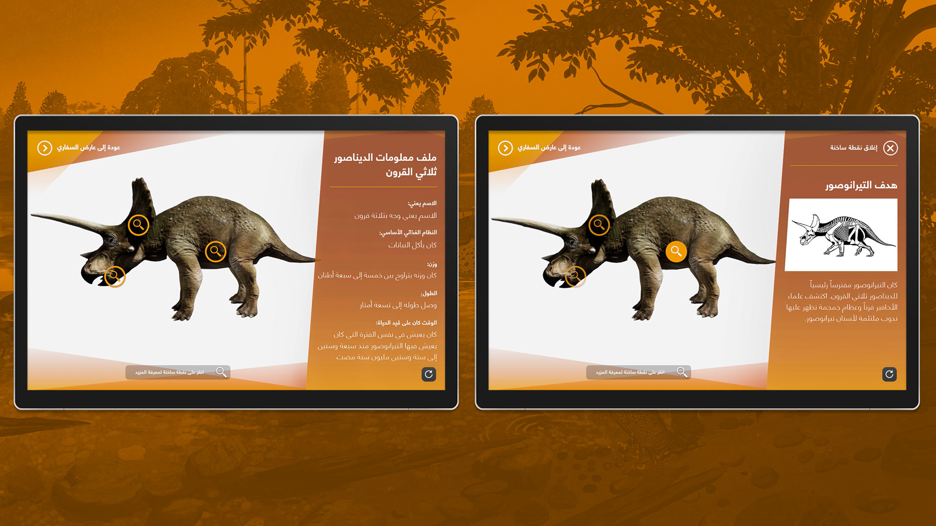
Triceratops - Arabic info screens
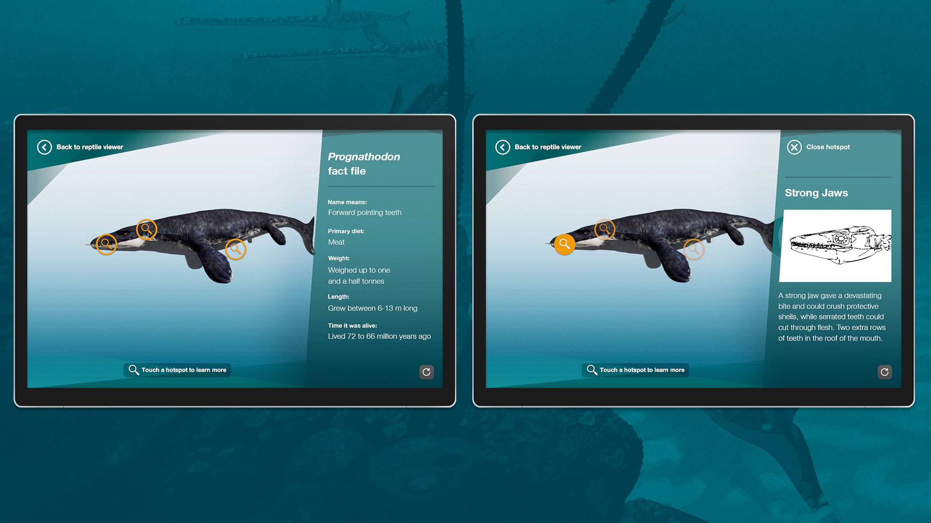
Prognathodon - English info screens
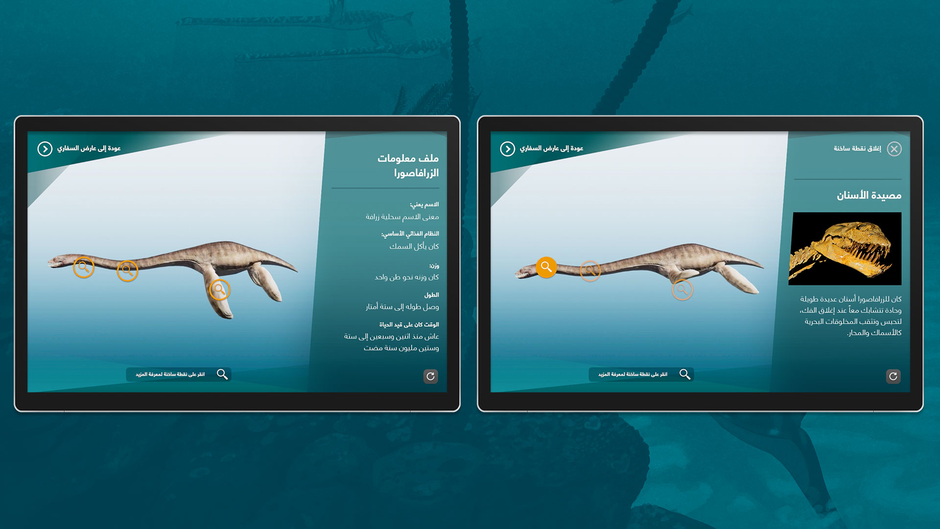
Zarafasaura - Arabic info screens
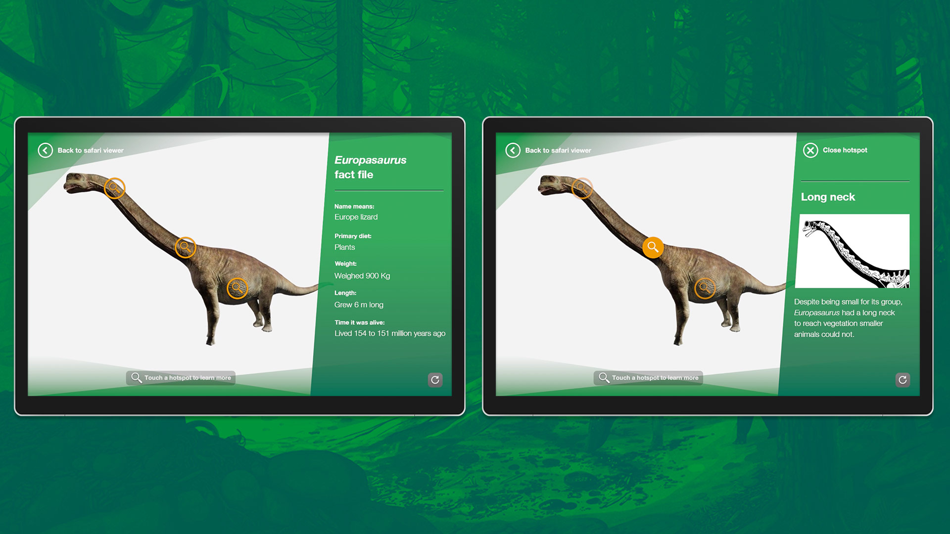
Europasaurus - English info screens
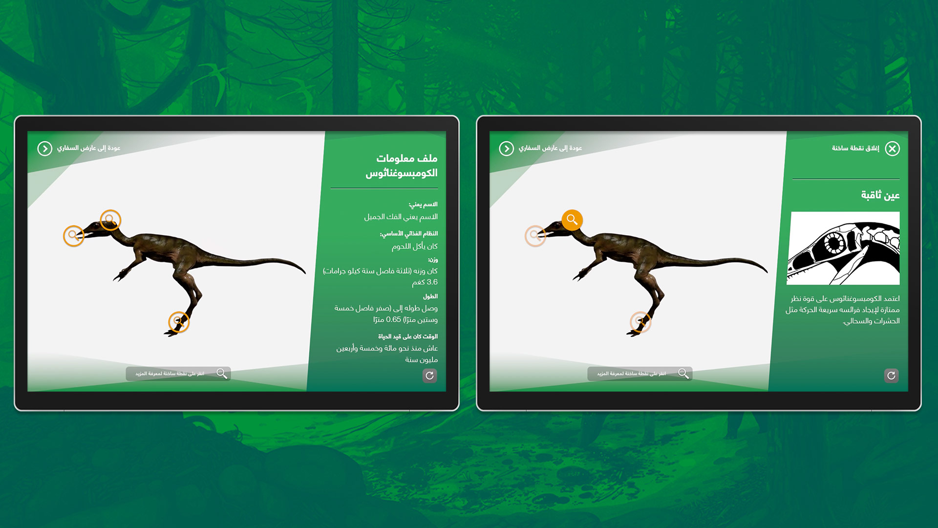
Compsognathus - Arabic info screens
Eyewitness Terminals
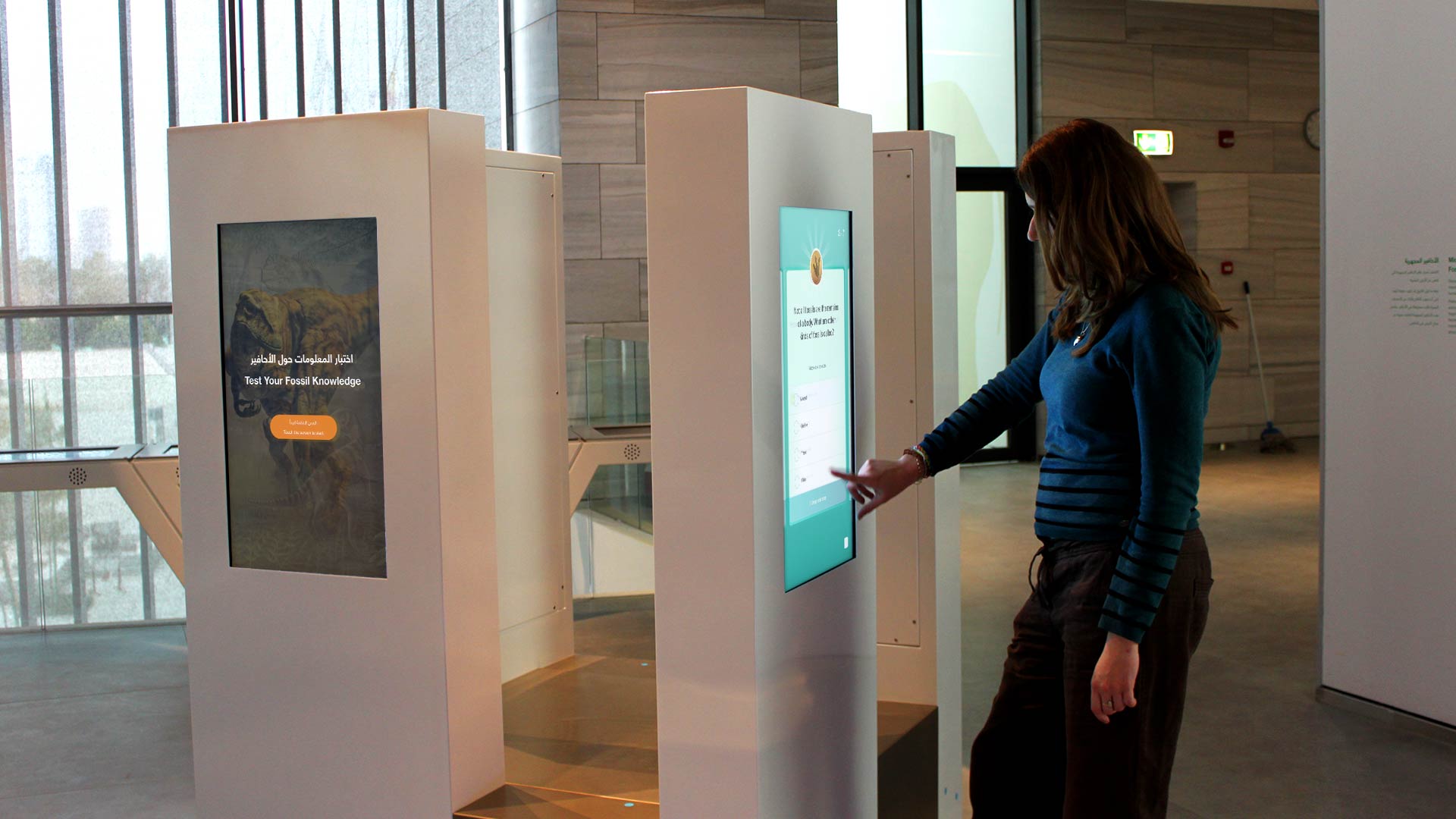
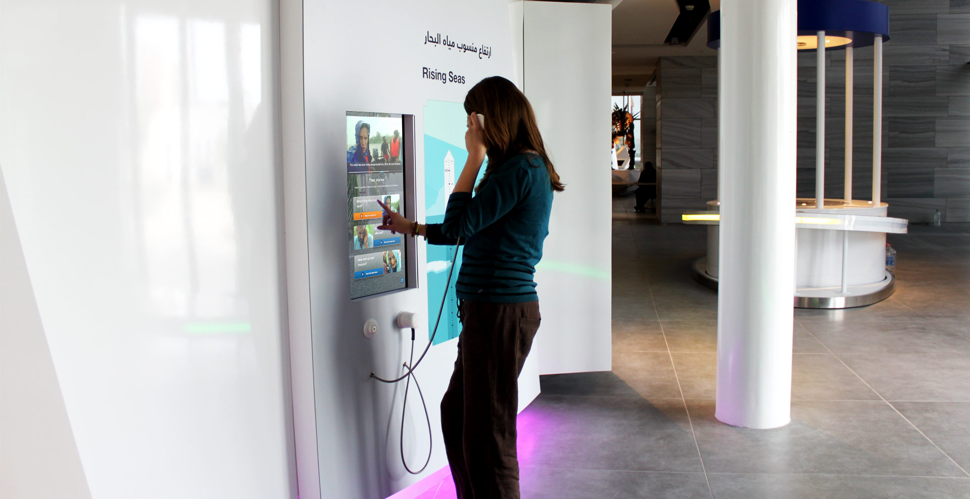
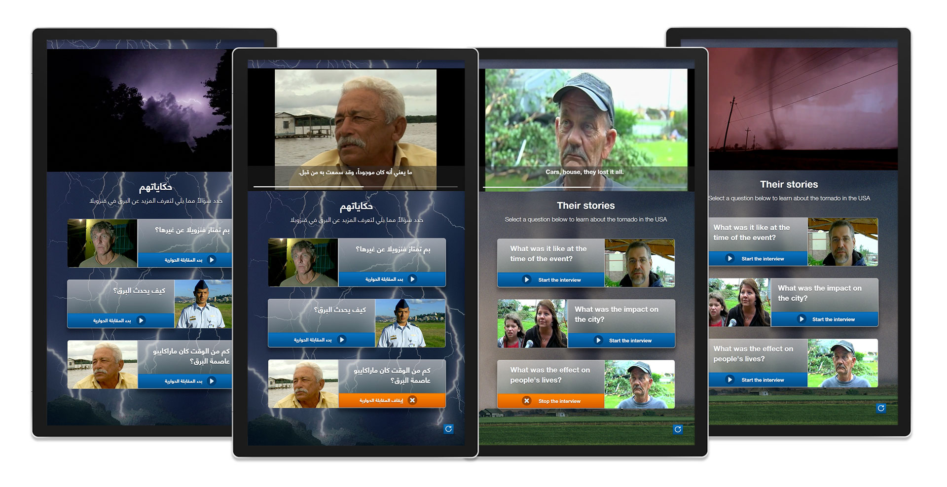
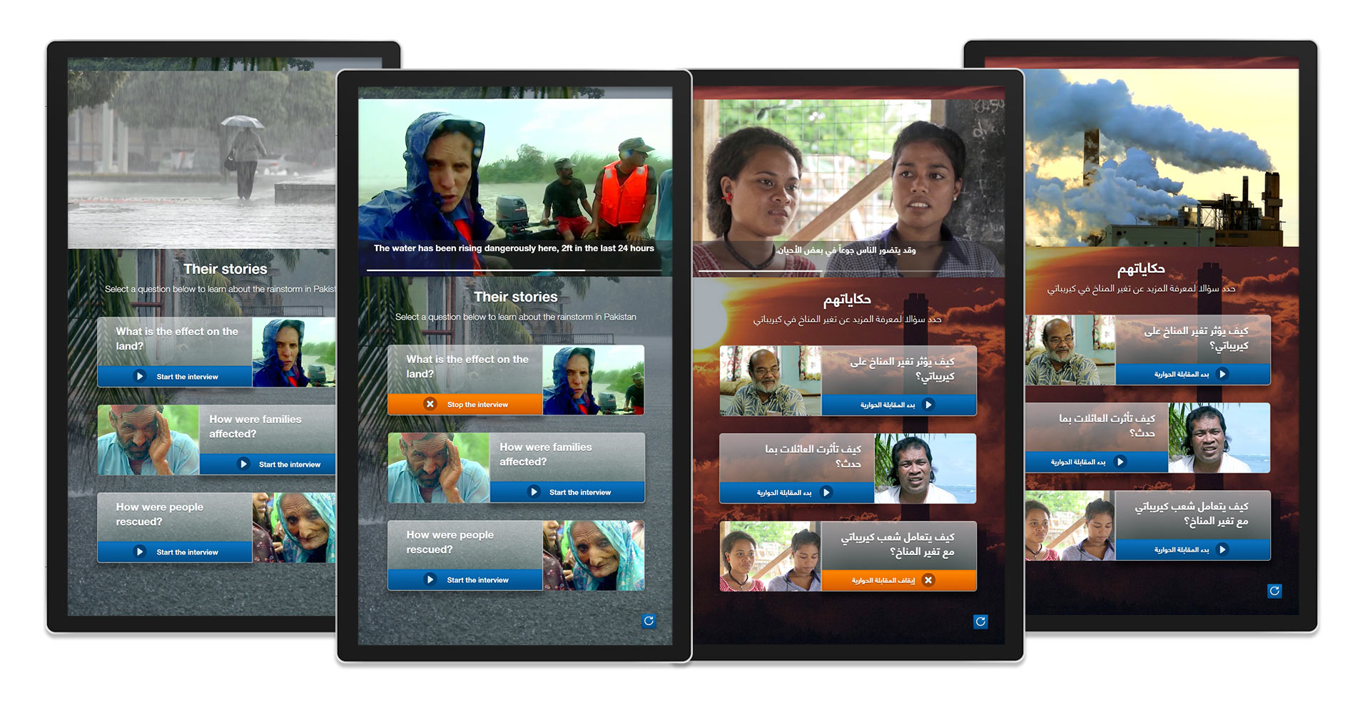
Dotted around the climate and nature galleries a series of 6 vertical terminals tell the eyewitness accounts of survivors of natural disasters such as volcanic eruptions or earthquakes. The interactives needed to be lightweight delivering video content in an easy to user interface with minimal text footprint.
Originally the interactive was pitched in briefing documentation to include 6 questions per interactive which would be answered by a real eyewitness of the events, as such we designed the interactive initially around a carousel unit. However during later content meetings it wasn't possible for the client to source this material easily. Following this I redesigned the interactive to focus around three core questions creating an almost jukebox interactive for selecting video content to play back to users.
As with other multi-use interatives in the gallery I focussed on creating a core user experience that could be replicated across all 6 terminals. With a consistent experience users can easily move between each version and instantly pick up the interactive and continue as they know what to expect, With these interactives I built a template that could be updated with different video files and themed via different background images.
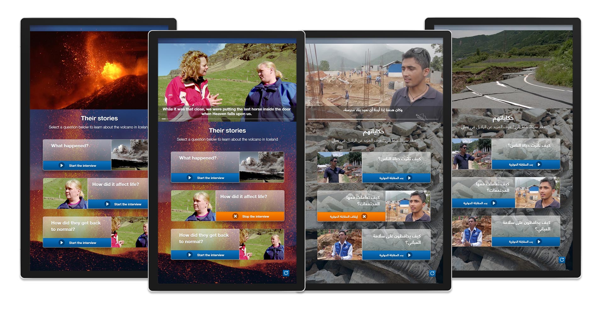
Design & Deployment
The SAASCC project provided a unique challenge for myself and the other designers on the project as we had to work in a dual language setup supporting both Arabic & English copy and the adaption for right to left reading that this involved. Throughout the UX and UI phase of the project I had to establish best practises with Arabic script whilst retaining a sense of familiarity between layouts and interactions.
Before starting the project we were provided with extensive visual style guides for the gallery and how to treat image and text content, working with this set of style guides I added a personality to each interactive whilst retaining the same sense of brand and overall look and feel that both the rest of the gallery and the museum had as a whole. Integrating UI that both adapted to different text content and also adapted to the environment around it fitting in with printed graphics from third parties.
I worked closely with the development teams on the project being the sole point of contact for all teams and managing weekly development sprints and builds to show progress to the client and conduct testing internally. With such a large-scale project it was not possible to keep all hardware in our agency at any one time and we had to juggle development timelines with hardware availability. On site I managed a small deployment team in Kuwait working to install, debug and fix interactives ready for the opening of the museum. Taking place over 5 weeks on site we finessed interactives and worked with unique challenges that the gallery threw at us such as unexpected lighting conditions and hardware reliability to adapt our existing builds to the environment delivering a project that was public ready ahead of time and within budget.