Introduction:
This style guide lists the elements of the stopwatch design for build. Where possible code has been provided to cut down on asset production & for clarity on all displays. Any image assets have been provided alongside this styleguide. When mentioned we have written the styles for the elements inside this document in the css file called element.css for your reference.
All code examples and elements are given for reference only. These have been written from a design perspective and may not reflect best practises within browser specifications and/or functionality and should be used for reference only.
General Information:
All views in both the teacher & pupil views are set to a fixed resolution of 1280px by 720px to accomodate a variety of school displays. The main container should be centered in the browser so if teachers load on a larger display that the content sits neatly within the window.
Each view is a seperate window/tab which interact with each other dynamically.
Colour Palette:
We use 5 colours throughout the interactives with 4 key brand colours. Below are the colour codes and names which will be referenced throughout this document
Premier league purple:
#37003C
Premier league pink:
#FF005A
Premier league Blue:
#05F0FF
Premier league Green:
#00FF87
Premier league Grey:
#00FF87
Typography:
We use 3 weights of the Premier League official font and one additional font for the stopwatch numbers, Shown below. We will reference these in this style guide when relevant for sizing and specific weights
Premier League Bold
The webfont name of premier league is named PremierLeague-Bold
Premier League Regular
The webfont name of premier league is named PremierLeague-Regular
Premier League Light
The webfont name of premier league is named PremierLeague-Light
DS Digital
The webfont name of premier league is named DS-Digital-Bold
Teacher views on the stopwatch & timer's are designed to give the teacher fine grain control over the system without interupting what the pupils can see on screen. As such the interfaces for the teacher views are much simpler & modular based using repeatable elements aligned centrally in the view.
The teacher views are always built upon the same structure framework of
1) Header
2) title
3) description
4) control region
This can be seen below for reference
The header runs full width at a height of 70px with a background-colour of premier league purple
The header contains the premier league logo right aligned which you can find in the assets pack as "prem-logo.png"
The header has two states one without a home button and one with. Please reference design files for when this is appropriate.
The header has internal padding of 46px left and right with all elements vertically aligned center inside the header.
Type
The titletext inside the header is set in Premier League Bold at a size of 22px seen below (see header-title in element.css)
Classroom Time Tools
Tools Home Button
The tools home button is a combination of an icon, text & a divider. We have included the home icon in the assets pack as "home.png", Text is set in Premier League Bold at a size of 18px (seen below as tools-btn-txt in element.css) Users should be able to click anywhere within the home button region left of the divider line to activate the button.
Tools Home
Combined elements
we have combined the elements into the following final piece below

Tools Home
Classroom Time Tools
The home page of the tools contains the header discussed above alongside two launcher regions in order to get to the tool of your choosing. These are built out of the following elements: title; description & the launcher element followed by a button.
See element.css for references to these sections. Some areas such as buttons are discussed at a later date in this guide. See img's "timer-icon.png" and "stopwatch-icon.png" for the icons used.
Timer
Create a timer to run classroom activities
Stopwatch
Complete activities against the clock
Elements - Main space
The main space of the teacher tools area is divided into a title for the screen, a small description sentence/s, The control units, buttons & progress indicators/
Title & Descriptors
The titles are set in "PremierLeague-Light" at a size of 40px (see pagetitle in element.css) in the colour premier league grey
The descriptor is set in "PremierLeague-Regular" at a size of 22px in premier league grey (see description in element.css)
The title has a top margin between the header of 30px and a bottom margin of 16px.
See combined example below.
Welcome to the classroom time tools
What tool would you like to use?
Control areas
Control areas contain the controls for managing the time settings. In the setup stages it is the case that we have 3 types of controls: timer value controls; reward tools & timer notes.
Timer Controls
Timer controls control what the value of the time is in the timer tool. This is comprised of arrow buttons that increase the time by 1 value and the text region that the user can click into to type the value they want.
The timer buttons are triangular buttons, these are included in the img pack with two states as "timer-btn-std.png" and "timer-btn-hover.png" When the button is disabled it is set at an opacity of 0.3.
The top level of the control unit sits with a margin of 50px from the description line. For detailed measurements of the elements please see releveant section in element.css for the included values.
The timer values are set in "PremierLeague-Bold" at a size of 100px set in premier league purple (see .timer-number in element.css). The center : is "PremierLeague-Light" set at 150px (see .timer-colon in element.css). Time values are flanked underneith by the value type set in "PremierLeague-Light" 32px (see .timer-name in element.css)
Reward Controls
Reward controls enable the reward area of the pupil view. This is made up of a checkbox to enable the dropdown control. And the dropbox box to select the reward type.
Reward value controls have a title of "PremierLeague-Bold" set in 20px in Premier league Purple
The dropdown box has a left hand area in the control unit to display a png image which needs to be configured. Seen below these units are in the reward controls section of element.css
Include a reward?
Choose your reward style
Reward Name
Class Notes
The class notes control unit allows teachers to type in a multiline text field at a locked height. When users are happy they click complete to continue. All elements of this multiline field can be found in the relevant class notes section of element.css
Begin Session
The begin session button elements are simply a big button that takes users through to the next steps and launches the pupil views. This is included in the relevant begin button in the element.css file.
Begin Session
Buttons
Throughout the setup screens and further interaction screens we use pink rectangular buttons. These have a hover state and a rounded corner radius of 7px. See below for versions. We have an inactive version of the button with a 0.3 opacity. The text in the button is set in "PremierLeague-Bold" at the size of 20px which is centered in the button vertically and horizontally. see the relevant section in element.css for values. We have included placeholder values and type styles inside the css for this element.
Progress Dots
Progress dots are used in the setup screens to indicate progress through setup. These can be found in element.css and have three varients. Active (current screen) Complete and inactive
Sample Screens
Combining these elements gives us the following setup screens - Follow the element.css file for references to these screens. At this stage it is worth noting that all measurements and builds are purely from a front end design perspective - measurements will need to be checked and adjusted during testing, these css values have not be built from a compatability perspective and as such BLKO will need to rewrite code to reflect our browser compatabilities.
Classroom Time Tools
Welcome to the classroom time tools
What tool would you like to use?
Timer
Create a timer to run classroom activities
Stopwatch
Complete activities against the clock
Tools Home
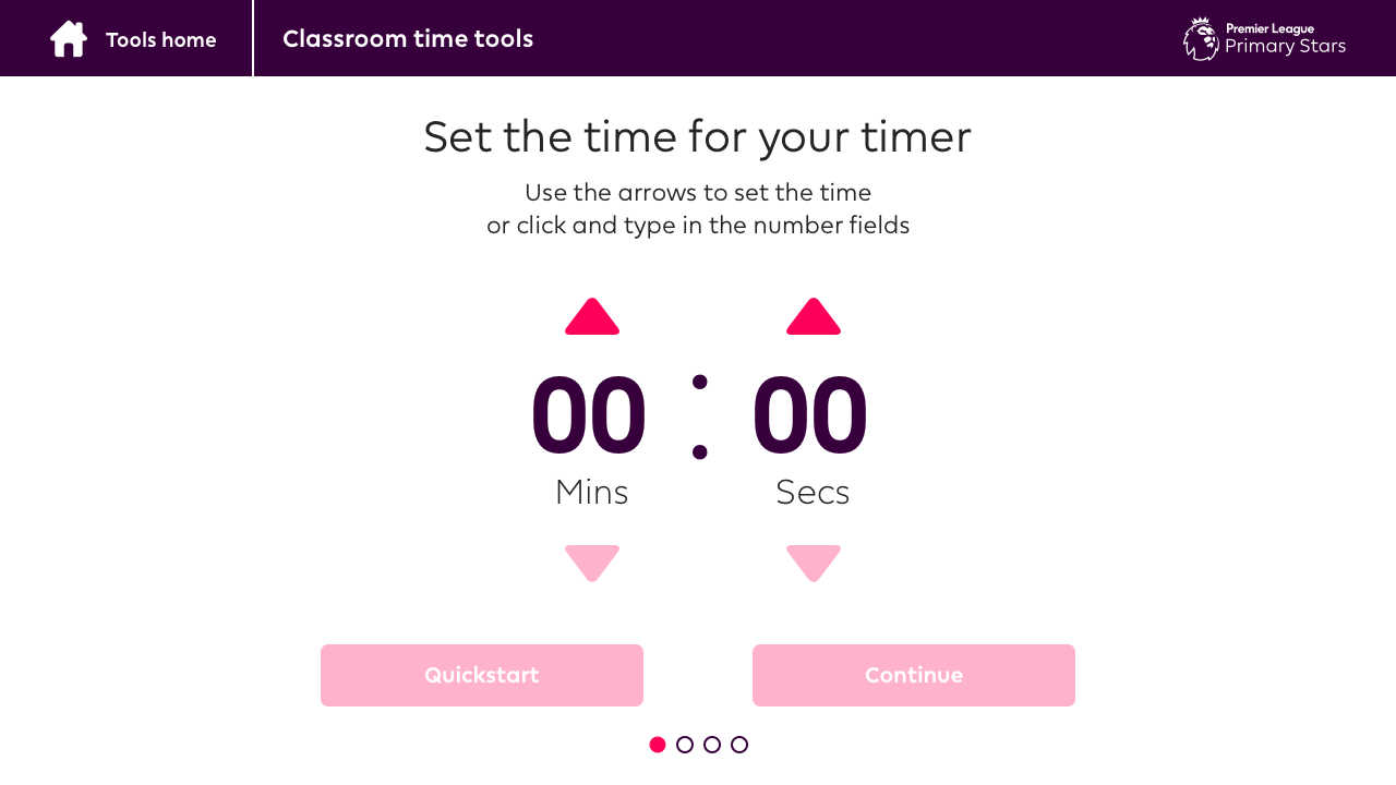
Classroom Time Tools
Set the time for your timer
Use the arrows to set the time
or click and type in the number fields
00
Mins
:
00
Secs
Tools Home
Classroom Time Tools
Choose your reward elements
Do you want to include a reward to the timer
as a visual reward to start and end moments?
Include a reward?
Choose your reward style
Reward Name
Tools Home
Classroom Time Tools
Timer Notes
Do you want to add any class notes to your timer?
You can always add and edit these whilst the timer is running
Tools Home
Classroom Time Tools
Timer Ready
Your timer setup is complete and your ready to go!
Click Begin Session to launch the pupil and teacher views
Begin Session
The teacher view when the timer is running is simple and integrates reusable components between stopwatch and timer similar to the setup screens
The standard timer view has a structure of
1) header
2) title
3) description
4) Time controls unit
5)Class Notes
The no class notes timer view has a structure of
1) header
2) title
3) description
4) Time controls unit
This can be seen below for reference
Class notes included
When the class notes are included we use a center aligned control unit of the same classnotes module from the setup alongside the timer values from the setup screens (Positioning adjustments applied). Under the timer value is a series of buttons: 1 button for start; 2 buttons for pause, resume & stop; and two or three pink buttons (adjusted widths) at the end.
Control Unit - time
The time control unit is similar to the setup screens with some slight adjustments for positioning of the elements without the up and down arrows. this can be found in timer running styles in element.css
00
Mins
:
00
Secs
Control Unit - Buttons
The round buttons are set at 120px square with a 120px border radius. These can be seen as timer-start-btn timer-stop-btn timer-pause-btn and timer-resume-btn in element.css
Combined Views
When combined the views look like the below - all elements can be found in the css file element.css. When the class notes are not included because of a quickstart we remove the class notes and center the timer controls. this can be seen in the last of this sections built screens.
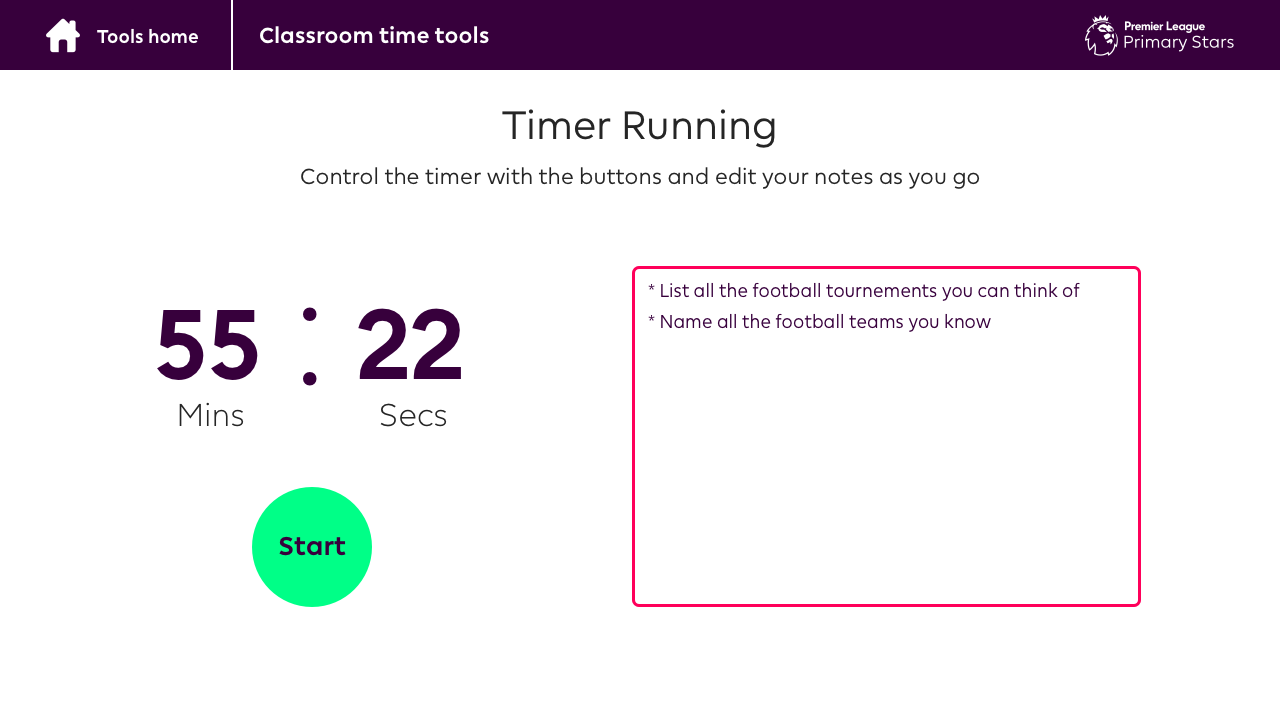
Tools Home
Classroom Time Tools
Timer Running
Control the timer with the buttons and edit your notes as you go
00
Mins
:
00
Secs
Start
Tools Home
Classroom Time Tools
Timer Running
Control the timer with the buttons and edit your notes as you go
00
Mins
:
00
Secs
Stop
Pause
Tools Home
Classroom Time Tools
Timer Running
Control the timer with the buttons and edit your notes as you go
00
Mins
:
00
Secs
Stop
Resume
Tools Home
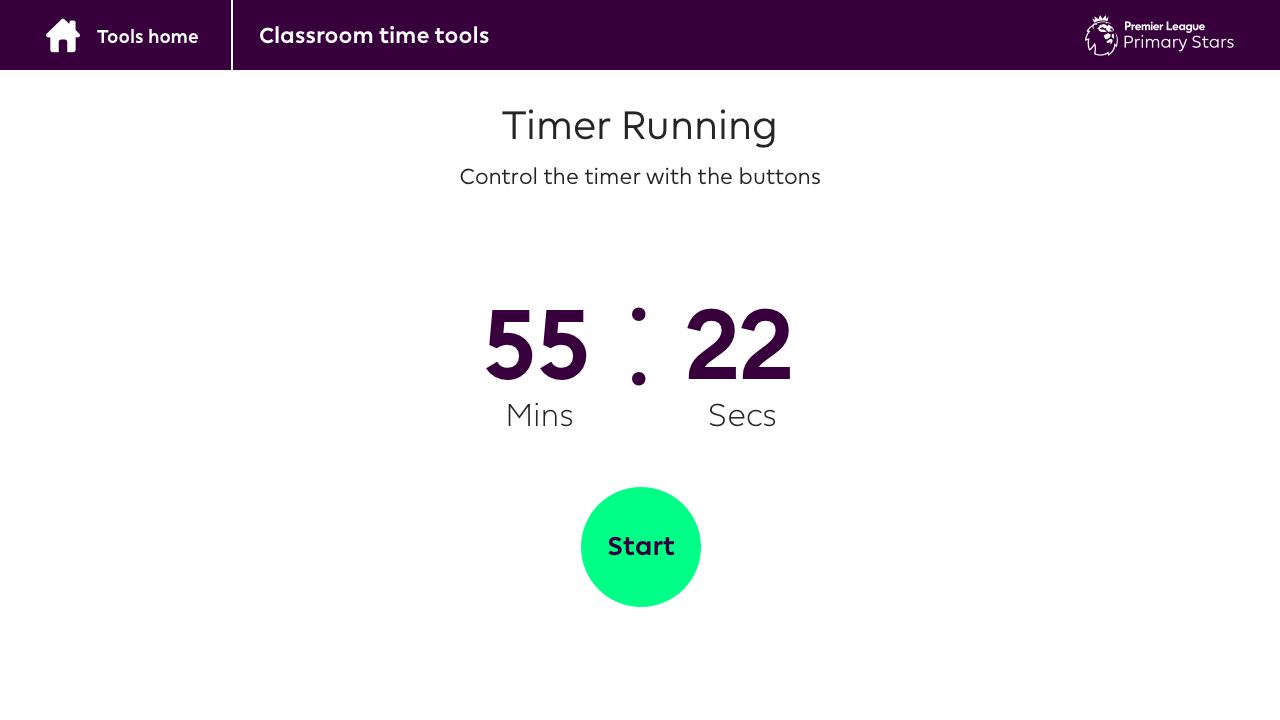
Classroom Time Tools
Timer Running
Control the timer with the buttons and edit your notes as you go
00
Mins
:
00
Secs
Tools Home
Classroom Time Tools
Timer Running
Control the timer with the buttons and edit your notes as you go
00
Mins
:
00
Secs
Stop
Resume
The pupil views when the timer is running all run on the same format with more richly illustrated assets. found in the img folder of this style guide.
The standard pupil view has a structure of
1) stopwatch area
2) media area
3) class notes
The quickstart pupil view has a structure of
1) stopwatch area
The no media area pupil view has the following structure
1) Stopwatch area
2) class notes
This can be seen below for reference
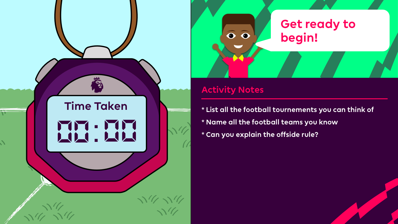
standard setup - left area
The left area of the standard setup includes a sml version of the pitch background - this can be found in element.css and the asset pack named "pupil-stopwatch-bg-sml.png"
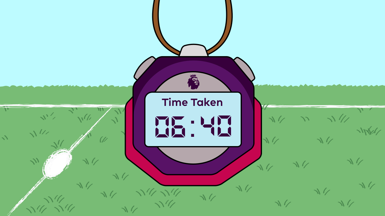
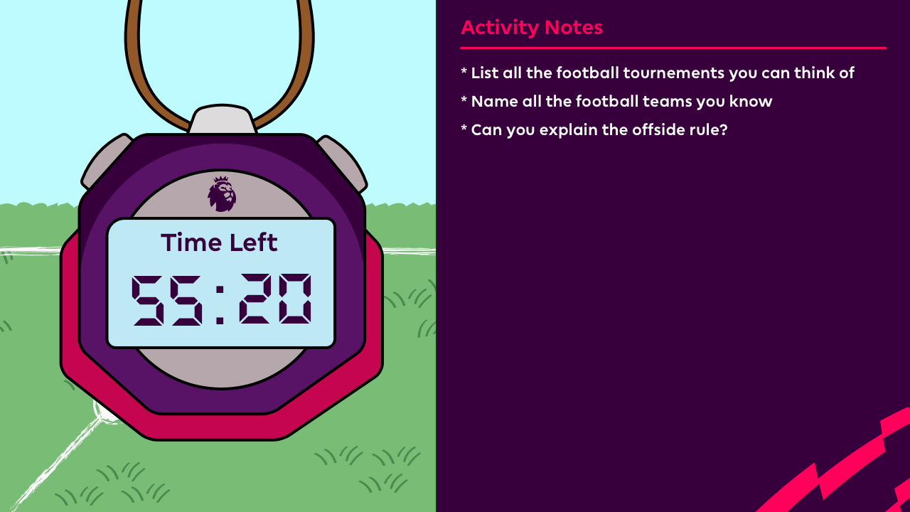
All setups - Stopwatch
The stopwatch area in the left area is comprised of the stopwatch illustration, a title value and the time values. The title is set in PremierLeague-Bold 28px in Premier League Purple. The time value is set in DS-Digital-Bold at 110px in Premier League Purple. When combined they appear as such.
Time Taken
60 : 60
Standard Setup - Right area
The right hand side of the display in the standard setup is comprised of a media area (likely to hold video) and the class notes. In the standard setup the classnotes are smaller in height.
Standard Setup - Class notes
The standard classnotes section has a background image which is named "pupil-notes-bg-sml.png" with the title of the activity notes set in PremierLeague Bold in Premier league Pink at 28px. Under the title is a dividing line set in Premier League Pink at 3px height. Finally the classnotes are set in PremierLeague-Bold at a size of 22px in white. All this is found in element.css
Activity Notes
No reward - Class notes
If the user chooses no reward elements to be displayed then the classnotes section fits to 100% height with the bg img named "pupil-notes-bg-lrg.png". The classnotes styles are the same as the standard setup just with a larger height on the text region.
Activity Notes
Quickstart - No Rewards or Notes
If the teacher chooses to quickstart then neither the class notes or the reward media region are displayed. In this case the stopwatch is just centered in the view with a full width background img named "pupil-stopwatch-bg-lrg.png".
Animations
The stopwatch in the pupil view will need some basic animations applied. We use the animation library animate.css documentation is available here https://daneden.github.io/animate.css/
The stopwatch element itself should BounceInDown when the modules load, An example of this can be seen here. When the stopwatch finishes or the teacher clicks stop the watch should perform a tada animation. An example of this can be seen here. When the teacher clicks pause or a half time moment happens the stopwatch should perform a shake animation this can be seen here
Combined Views
When combining these elements together you can see the following views take place. See element.css for references.
Time Taken
60 : 60
Activity Notes
Time Taken
60 : 60
Time Taken
60 : 60
Activity Notes