Project overview
As part of the 'Whales: Beneath the surface' exhibition opening at the Natural History Museum we were tasked with creating a physical experience where users could get into the head of a whale. Whales hunt prey using Echolocation - a sonar like vision that enables them to see in the dark of the ocean. The challenge of the project is that scientists are not able to yet fully understand how whales see the process of echolocation inside their brains.
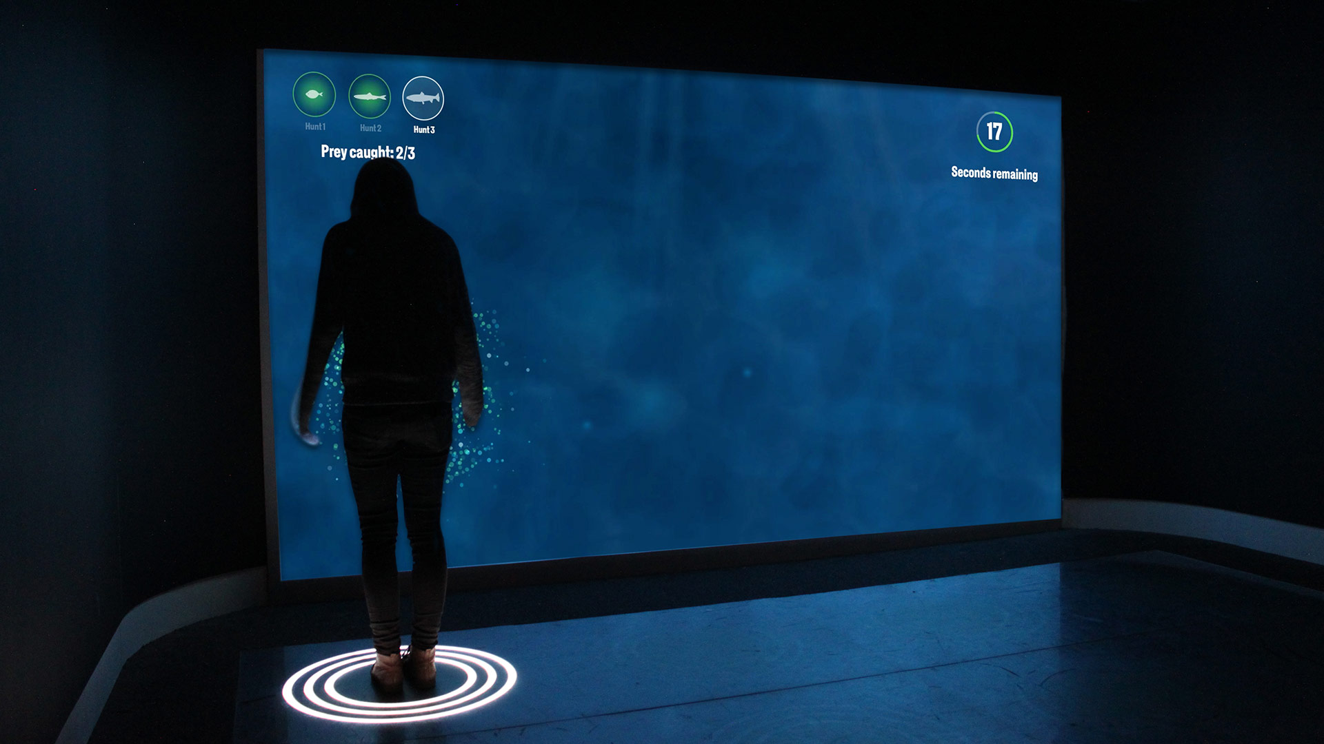
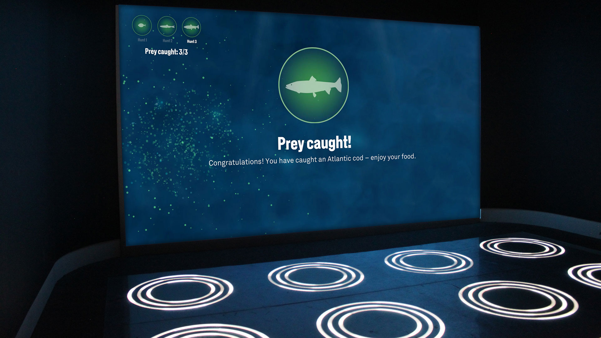
As our response we delivered a showcase experience space where users needed to use both audio and visual clues to hunt down the whale's prey which was located somewhere within the space. I created the unique concept, UX and UI for the experience and worked with technology and hardware teams at NHM to create the end result.
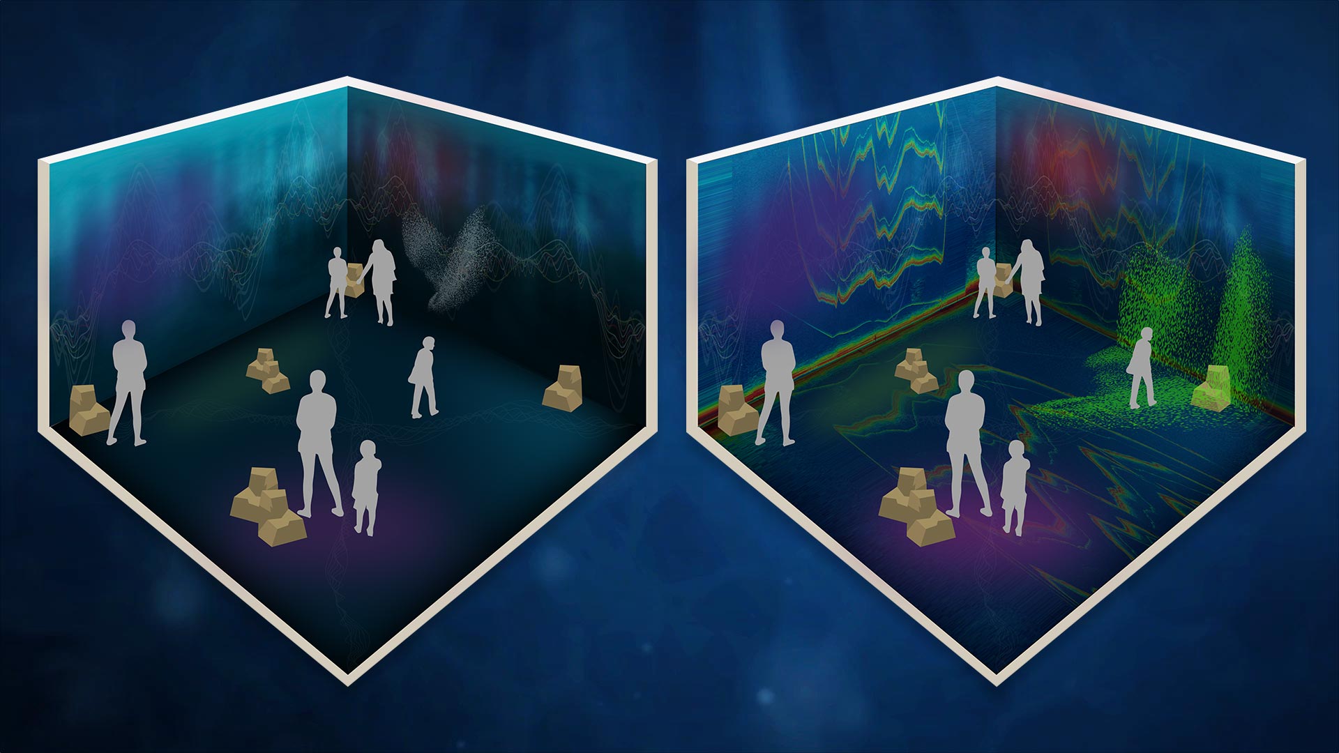
Pitch concept using projected visuals & audio.
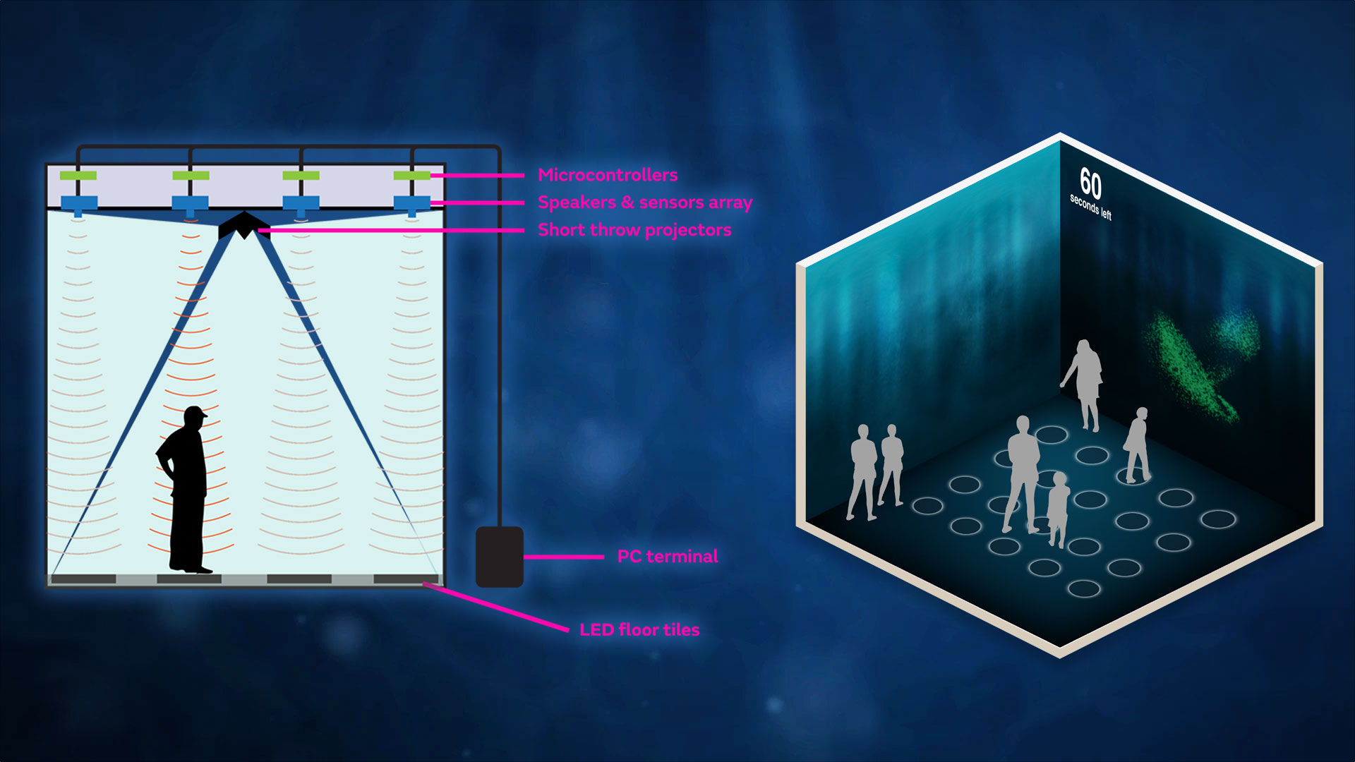
Revised concept post testing.
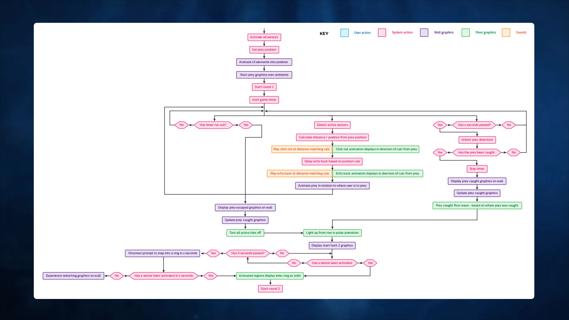
Sample of the exhibit flow See full flow
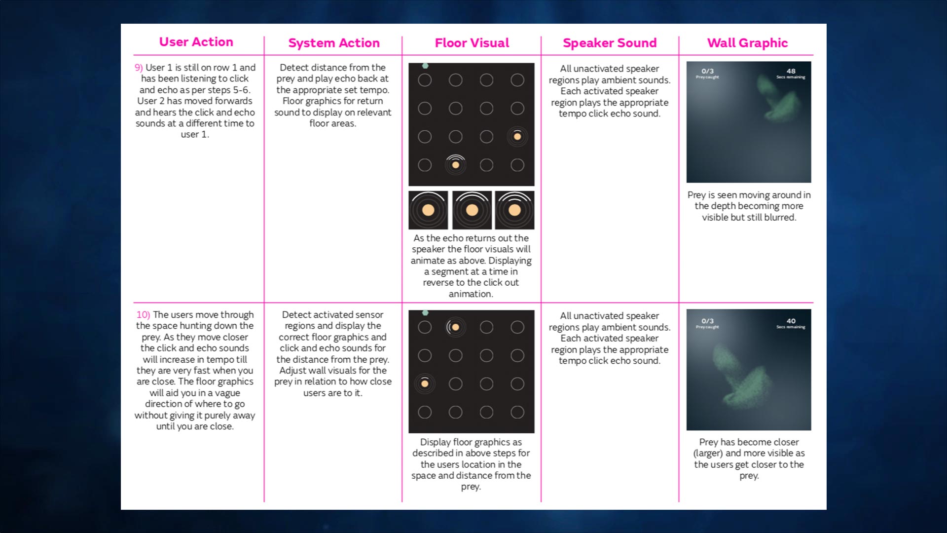
Sample of action flow sheet.
UX & concepting
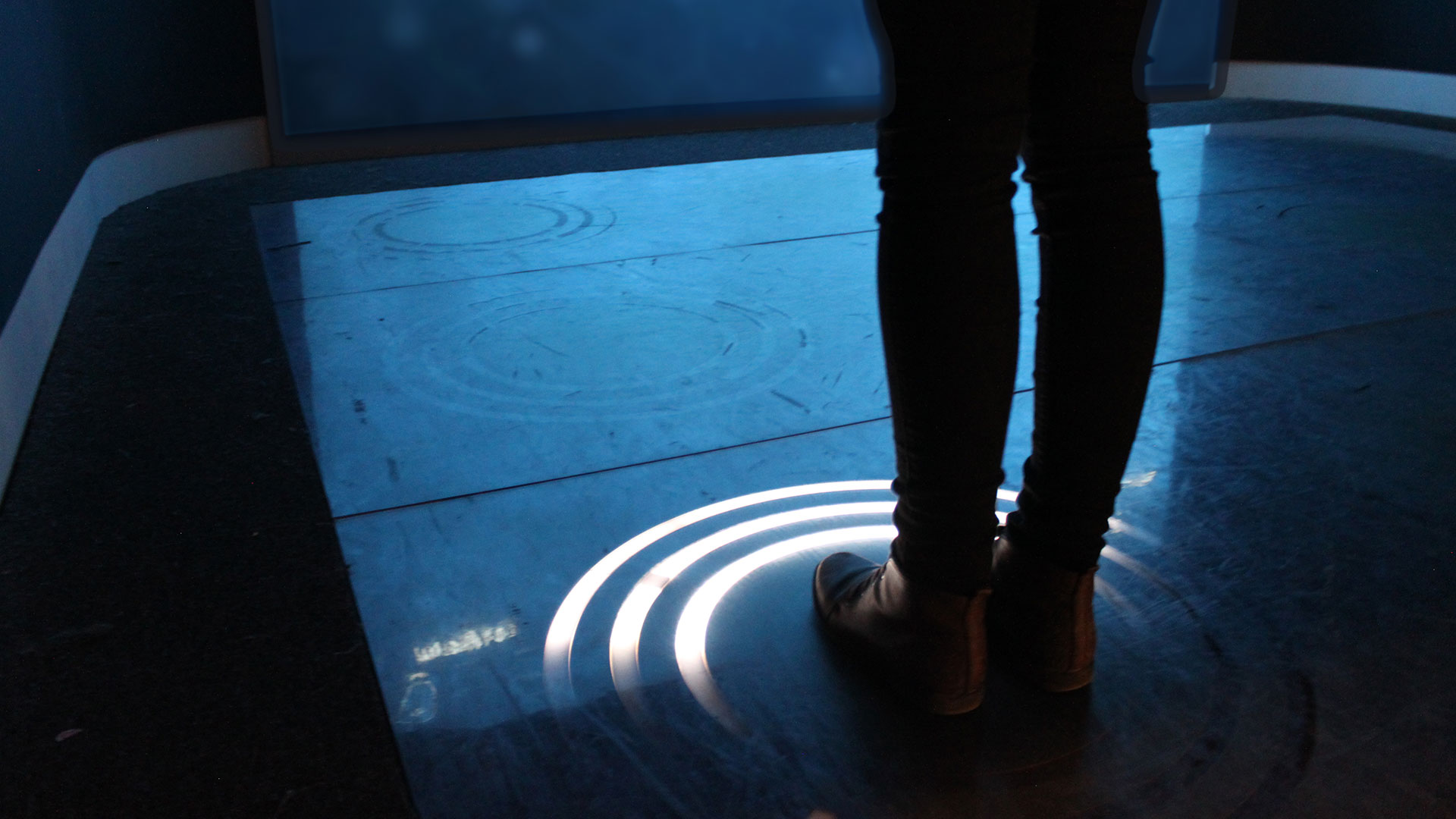
The original pitch format for the experience was to create an experience where users would move around the space following a projected visual and using solely sound to track the prey. We conducted initial user discussions around this idea with a low fidelity mockup using an example of the sounds however after this session it was deemed that being realisitic to the whale was not feasible for the experience. Following this session we re-worked the idea around the sound element and a visual tracker. The tracker on the floor consisted of a connected LED ring that would fire out a pulse from the users position and return to the user in time with the audio giving you an indication of which way to travel next (Left, Right or Up).
I worked on the technology concept for this with our developer and the team at NHM. The overall technology combination for tracking users consisted of a speaker positioned above each LED floor pad with an infra-red sensor attached. The pads were connected with each sensor via an arduino with a server PC running the interactive. We ran various different tests on the physical rings with the museum along with in person tests with members of the staff and selected visitors to the museum. This system resonated with users senses much more and gave an almost 100% success rate at catching the prey. Rather than conducting a series of wireframes for this unique experience we created a step by step logic trail in a spreadsheet detailing each users action and the corrosponding reaction from the various components of the system. Each floor tile animated sequence was also detailed in depth in documentation This aided testing whilst helping the client to visualise each area for signoff.

UI & Deployment
The application was developed in sections with the UI coming at a later date to the floor and audio controllers. I worked on the UI with a video artist to art direct the atmospheric animated background visual that the prey swam around in and an audio creator to create the echolocation pings. The prey visual was created entirely with code based particles giving us further control over its movements to appear as fluid and ambiguous as possible. To marry all the pieces together I created an overlay set of graphical icons and visuals to create the game element of the experience. This was then pieced together in an animated sequence before being integrated into the final build.
Alongside the NHM technical team I worked on the final install and configuration of all the individual components of floor tiles, sensors, speakers and visuals. During a two week testing period on site we decided to create a visual front end for what was happening in the background, This showed every floor tile reaction, audio playback and sensor in real time. The controller showed a visual representation of the floor showing where the prey was at all times and also people, this helped to diagnose any issues in the system such as a speaker or sensor failure.
Echolocation in action